
Live Preview
Choose a preview background, place text and image layers, and configure shopper editing, zoom, or multiple views in Podifai.
Last updated: 2026-11-06
Live Preview is optional. Use it when shoppers should see a real-time product visualization, or turn it off for an option when the option should only collect a selection without changing the product image.
Overview
Live Preview shows shoppers how their choices will look on the product image. The preview updates as they select options, type text, or upload images.
Choose the setup task you need:
- Build your first engraving customizer with a complete setup and verification checklist.
- Choose the preview background for the product or selected Shopify variant.
- Place text on the product and configure fonts, colors, and alignment.
- Prepare option and preview images, then position image layers.
- Set up separate product views for front, back, or other sides.
- Collect options without changing the preview.
Use Options Without Live Preview
You can use Podifai custom options without Live Preview. The option will still appear on the storefront and the shopper's selection will still be saved with the order; it just will not update the product image in real time.
This is useful when you want to collect back-side text, production notes, or uploaded files without showing them on the current preview image. Text entries and image uploads still appear in Shopify admin order information and in the Podifai Orders tab.
What this shows
- Open the product's option set in the Podifai editor.
- Select the custom option you do not want to show in Live Preview.
- In the right-side Properties panel, open the Live Preview tab and turn off the Live customizer toggle for that option. Turn it back on the same way.
- Click Save, then test the option on the storefront.
Supported Option Types
Most option types can update the preview directly. Color Swatch can display a Preview Image assigned to each value, or use Link color swatch to control text and effect colors. Font Swatch uses Link font swatch to control the font of a Text Input or Text Area.
| Option Type | Live Preview Support |
|---|---|
| Image Swatch | Supported directly |
| Dropdown | Supported directly |
| Badge Group | Supported directly |
| Checkbox | Supported with an image-enabled layout |
| Text Input | Supported directly |
| Text Area | Supported directly |
| Image Upload | Supported directly |
| Color Swatch | Assign a Preview Image to each value for direct image preview, or use Link color swatch to control text and effect colors |
| Font Swatch | Use Link font swatch to control Text Input or Text Area font |
Choose When Live Preview Appears
In the product editor, open Global Settings → Live preview → Show preview. Choose On page load or After 1st change, then click Save changes. This is a shop-wide setting for all products.
In Inline mode, After 1st change keeps the original product image visible until the shopper interacts with a Podifai custom option, such as making a selection, entering text, or uploading an image. Changing a native Shopify variant alone does not trigger this setting. The preview then uses its configured background, such as a dedicated Custom img.
Once triggered, the preview stays visible. Returning an option to No does not restore the original product image. This is expected: the setting tracks whether the shopper has interacted, rather than continuously showing or hiding the preview based on the current choice.
In Popup mode, clicking Customize already triggers the preview. Shoppers see the configured Live Preview when the popup opens with either setting.
Change the Preview Background Image
Choose a preview background source, or start with a blank canvas:
- Variant image — Follow the image assigned to the shopper's selected Shopify variant. This choice appears only when the product has Shopify variants.
- First Shopify product image — Use the first product image from Shopify.
- Last Shopify product image — Use the last image in the Shopify product gallery as the preview background.
- Custom image — Upload a dedicated background image for the preview.
- Blank canvas — Show the design without a background image.
If Last Shopify product image is missing from an editor tab that has been open for a while, save your work and refresh the tab. If it is still missing, use the chat icon on the left side of the page or email chelsea@podifai.com with the product URL and a screenshot of the background choices so the team can investigate.
A template also needs a defined preview canvas, but it does not require an uploaded base image. When you create a template directly from My Templates, either upload a base image or choose an image ratio for a blank canvas. The selected ratio gives Podifai the dimensions it needs to position and size the template's preview layers.
First Shopify product image uses the first image on the Shopify product. Make sure the product has an image in Shopify admin. A square image is usually easiest to adapt across templates and screen sizes.
Use Variant image when Shopify controls product choices such as color or size and the personalization should stay on the selected variant. See Shopify Variants vs Podifai Options for the recommended setup.
Variant image follows the image assigned to the currently selected Shopify variant. If that variant has no assigned image, Podifai falls back to the first Shopify product image. It does not follow a shopper clicking an unrelated secondary image in the product gallery. It works best when variant images use the same composition, product position, and aspect ratio—for example, when only the product color changes—so engraving, monogram, and other overlay layers remain aligned. It works with both Inline and Popup display modes.
What this shows
- Choose the preview background source.
- Use the first Shopify product image, a blank canvas, a custom image, or the selected variant image.
- Prefer a square product image for easier responsive placement.
Thumbnail Image vs Preview Image
For visual options, the thumbnail image and preview image can be the same. Use this when the swatch image is also the image you want to show on the product. Image Swatch thumbnail and preview images can be up to 2 MB each.
Use the same image for thumbnail and preview
What this shows
- Upload the swatch image.
- Use the same file as the preview image when it should appear on the product.
- Keep image assets consistent across all values and under 2 MB each.
They can also be different. Use this when shoppers need a simple thumbnail, but the preview needs a cleaner image, transparent PNG, cropped detail, or prepared design asset.
Use different thumbnail and preview images
Image Swatch Selection Modes
Choose the selection behavior in Image Swatch Properties → Field:
- Single selection — The shopper chooses one swatch. The preview updates to that value.
- Ordinary multiple selection — Turn on Allow multiple option values with Allow quantity per option off. Each value can be selected once. Min selections and Max selections count different values and define the valid range for final submission.
- Quantity per option — Turn on Allow quantity per option to allow repeated units of a value. Set the per-option and total quantity limits. Three of one design plus two of another is five units across two different values.
These Field settings control choices and quantities. Multiple position in Live Preview controls image placement for ordinary multiple selection and quantity per option. One Image Swatch can collect the choices for several charms, patches, or graphics. See selection and quantity settings.
A required single-select Image Swatch can also start with no value selected. In Default option, click the selected value again to deselect it. The customer will still need to choose a swatch before adding to cart, but the preview will start from the base product image instead of showing a default logo, patch, or design.
Configure Multiple position
Open Image Swatch Properties → Live Preview and enable Live customizer. Under Multiple position, use the position cards to set image size, X and Y position, and rotation, then choose Drag & snap or Drag freely under Mode. Selection and quantity limits remain in the Field tab.
Check the preview while adding and removing different values and, in quantity mode, repeated units. A total quantity counter describes selected units; use the position cards and preview to configure their layout. See placement modes for fixed slots and free movement.
What this shows
- For this ordinary multiple-selection example, turn on Allow multiple option values and leave Allow quantity per option off.
- Set Min selections and Max selections in Field.
- Configure the image positions under Live Preview > Multiple position.
Image Preview Layers
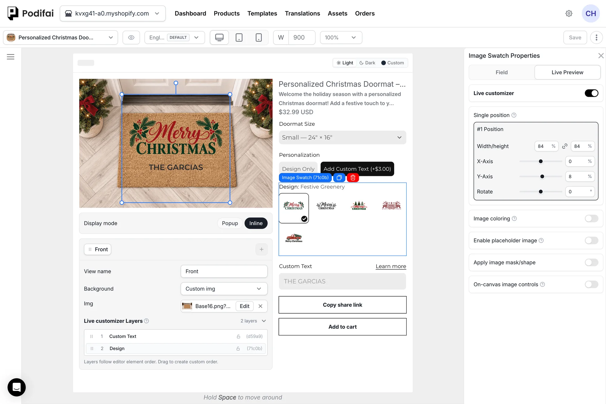
Image-based options can place images on the preview canvas. This is useful for product graphics, patches, charms, materials, artwork, or uploaded images.
- Position — Move the image to the right place.
- Size — Resize the image layer.
- Rotation — Rotate the image when it needs to match the product angle.
- Layer order — For multi-select Image Swatches, show selected images in order.
What this shows
- Select the preview layer.
- Drag it into position on the product image.
- Adjust size and rotation until it matches the intended placement.
Fabric, Pattern, and Logo Layers
A shirt preview can combine a fabric-color background with separate collar and logo layers. Changing a collar choice should preserve the selected shirt color. Use prepared image replacements or Image coloring for suitable artwork; plain fabric variants do not supply missing pattern or logo files.
First confirm which artwork already exists and which areas change independently. A back logo needs a matching Back view; Multiple Views is available in Popup mode only. See the layered product asset checklist for preparation and alignment.
Live customizer Layers
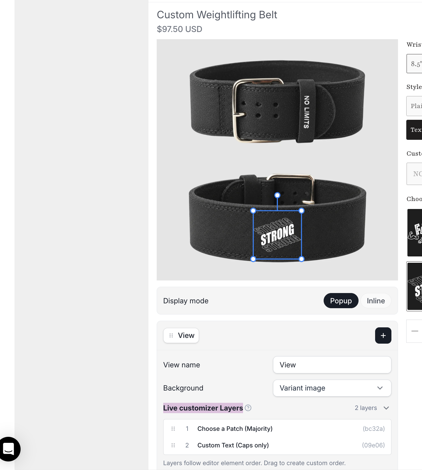
Under the product preview, open the view and expand Live customizer Layers. The list follows the editor element order by default. Drag a row to set a custom layer order.
This list controls preview layers. The left-side Option Layer panel shows options and groups.
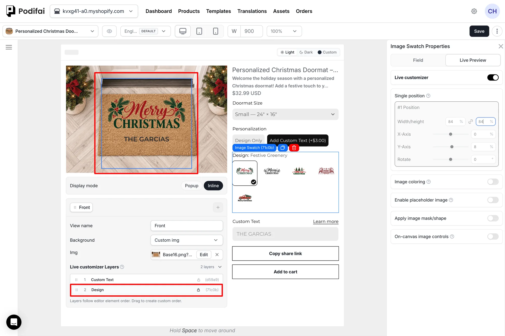
Lock a Layer
Click the lock icon on a row in Live customizer Layers to lock that layer. A locked layer can't be moved, resized, or rotated on the editor canvas, and its position settings in the right panel are greyed out. This stops a finished layer from moving by accident while you arrange the others. Click the lock icon again to unlock it.
Text Preview Layers
Text Input and Text Area can place shopper-entered text on the preview canvas.
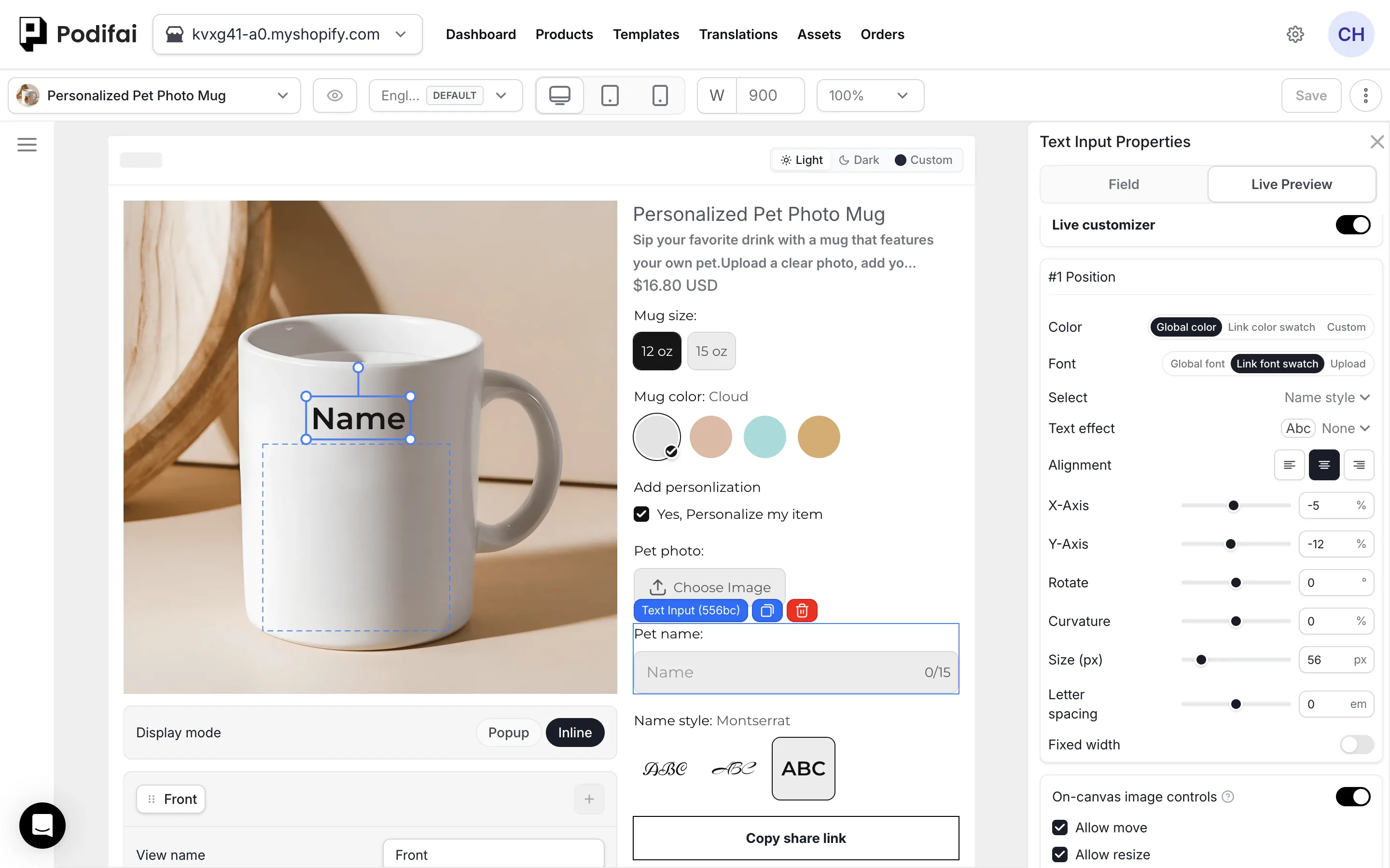
- Position — Move the text to the right place.
- Size — Resize the text layer.
- Rotation — Rotate text for angled placements.
- Font — Use a fixed font or link to Font Swatch.
- Color — Use a fixed color or link to Color Swatch.
- Alignment — Align text left, center, or right inside its preview area.
- Custom shadow — Configure a custom box shadow and shadow color.
Link Color Swatch to live preview text
Use a custom font in live preview
On-canvas Image Controls
On-canvas image controls (previously called Show bounding box on storefront) lets shoppers select a supported image or text layer on the product preview and use the movement, resizing, and rotation actions you allow. Configure this separately for each supported option, including Image Swatch, Image Upload, and Text Input.
What this shows
- Open the product in the Podifai editor and select the Image Swatch, Image Upload, or Text Input option in the custom option form.
- In the selected option’s Properties panel on the right, open the Live Preview tab.
- Enable Live customizer so the option contributes a layer to the preview.
- Scroll within that option's Live Preview tab and turn on On-canvas image controls.
- Choose Allow move, Allow resize, and Allow rotate independently, then save the customizer.
- On the storefront, select a swatch value, upload an image, or enter text, then select the resulting preview layer and test the enabled actions.
Choose the Allowed Actions
- Allow move — Let shoppers reposition the image.
- Allow resize — Let shoppers change the image's size.
- Allow rotate — Let shoppers change the image's angle.
For movement and rotation at a fixed size, enable Allow move and Allow rotate, and leave Allow resize off. Enabling the main control does not mean every action is allowed.
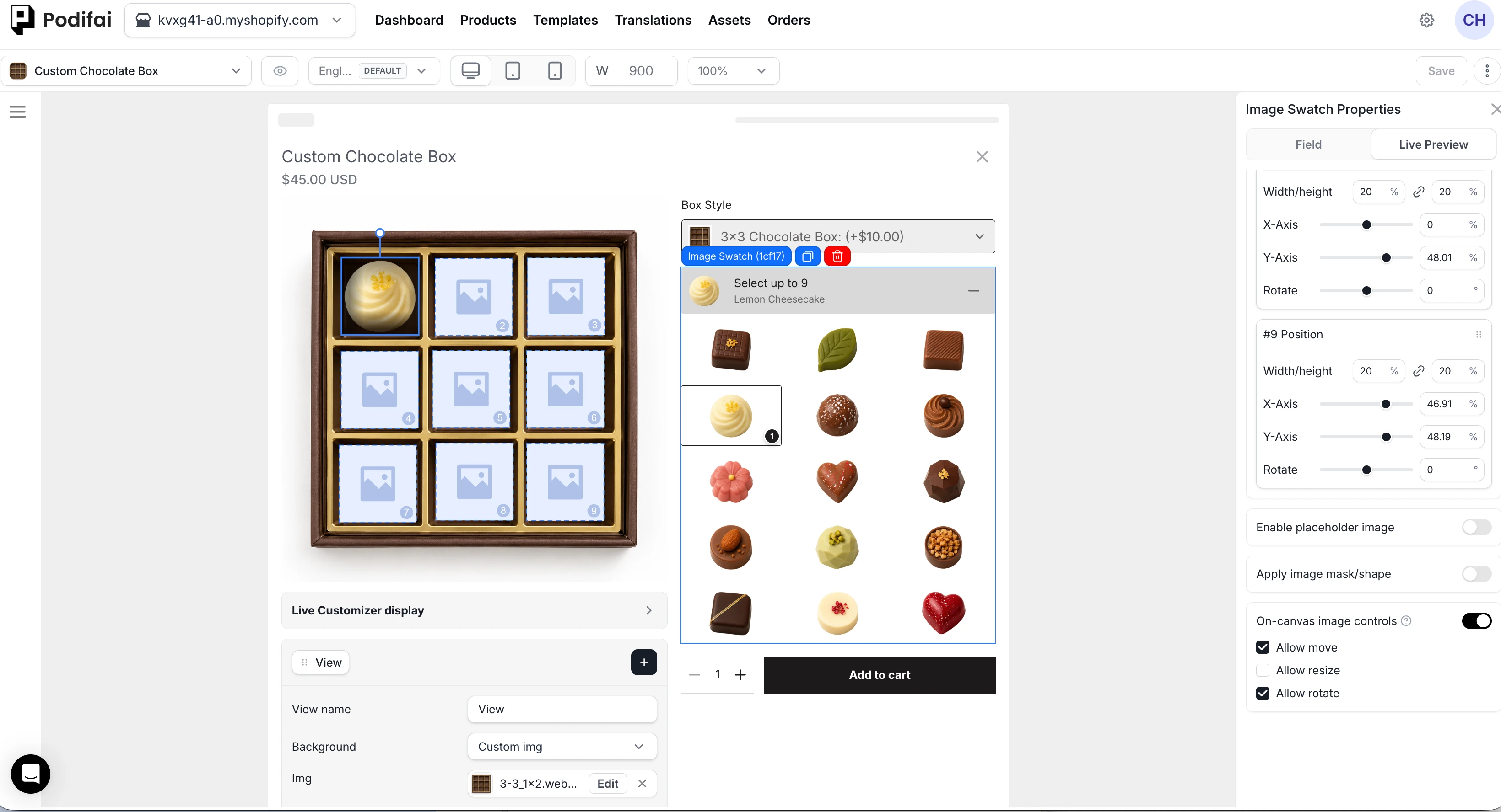
Arrange Multiple Image Swatch Selections
For multiple selected images, use Multiple position → Mode → Drag freelywhen shoppers should position images freely, then enable the required on-canvas actions. Drag & snap arranges images in predefined slots. See Charm Builder placement modes.
Theme Compatibility Notes
For broader theme guidance, see Theme Compatibility.
- Check theme image zoom. Shopify theme gallery zoom can intercept clicks intended to select the preview image. If this happens, disable the theme gallery zoom and retest. This is separate from Podifai's Enable live preview zoom setting.
- Check product-image sliders. A gallery slider or carousel can intercept click and drag events. If enabled image controls do not respond, test a non-slider gallery layout or compare Popup mode to identify a theme interaction.
If your theme doesn't allow disabling image zoom or switching off the slider, message us via the chat icon on the left side of the page, or email chelsea@podifai.com, with your theme name, store URL, and product URL so we can check compatibility. Our team is online every day from 09:00 to 24:00, Melbourne time, but theme-specific fixes may take longer than the first support response.
See Storefront Image Editor for the full setup, including the separate Uploaded image editor popup setting and its Reposition, Scale, Rotate, Adjust opacity, Grayscale, Remove background, and Zoom preview tools. For built-in and custom PNG masks, see Image Masks.
Curved Text
Curved Text bends shopper-entered text along a circular path. Use it for round or curved products, such as rings, mugs, badges, seals, or ornaments.
What this shows
- Select a text preview layer.
- Turn on curved text.
- Adjust the curvature until the text follows the product shape.
Text Effects
Text layers can also use visual effects. Use these when the preview text should look closer to the final product style.
- Engrave — Recessed engraving appearance
- Emboss — Raised appearance
- Outline — Stroke around text characters
- Soft Shadow — Subtle drop shadow behind text
- Neon — Glowing neon light effect
- Metallic / Chrome / Glossy — Simulated metallic finishes
- Gradient Fill — Color gradient across text
- Retro 3D — Three-dimensional retro lettering
- Echo / Glitch — Stylized distortion effects
You are not limited to the preset effects. Use the custom box shadow controls when you need a specific shadow offset, blur, or color. The text color and effect color can each use a custom color or be linked to a Color Swatch.
Front, Back, and Multiple Product Views
Multiple Views is available for products that need separate 2D sides or angles, such as the front and back of a jersey, a bottle with more than one print area, or apparel with front and sleeve artwork. A customizer can contain between one and five views.
Create clearly labeled views such as Front, Back, or Left Sleeve, give each view its own background and preview layers, and let the shopper switch between them without losing earlier selections. Multiple Views is available in Popup mode only.
- Separate backgrounds for each product side or angle.
- View-specific layers for text, images, swatches, and shopper uploads.
- Persistent selections while the shopper switches between views.
- 2D view switching between configured product views.
See Multiple Views for setup guidance, background image preparation, use cases, current boundaries, and a storefront testing checklist.
Show the Final Preview in the Cart
For Horizon cart thumbnails, follow the tested Liquid edit in Cart Preview Image. Check the cart separately from the product-page preview.
Best Practices
- Use high-resolution product images.
- Keep product and variant images at the same aspect ratio and dimensions.
- Place layers where the customization should appear.
- Test on mobile and desktop.
- Use Curved Text for round products.
See Image & Asset Requirements for file limits, recommended formats, dimensions, and performance guidance.
Drag and Drop with Multiple position
With Allow multiple option values enabled and Drag & snap configured under Live Preview > Multiple position, shoppers can drag an unselected charm from the option list onto the preview to fill an empty slot. At the selection limit, dropping an unselected charm onto a filled slot replaces that charm. To swap selected charms between slots, drag them directly on the preview. On desktop, hover over a preview charm to reveal its delete control.
With Allow quantity per option off, shoppers can temporarily select fewer than Min selections or more than Max selections while editing. Podifai displays a warning and still lets them add or remove values. Final validation blocks submission when the selection is below Min selections or above Max selections. Shoppers can still select, remove, or replace values while editing.
With Allow quantity per option on, use the per-option and total quantity limits instead of Min selections and Max selections.
Find the Selected Element in the Editor
Click a custom option, such as an Image Swatch, to activate the Field tab in the right panel. Click an element in the product preview to activate the Live Preview tab.
For Multiple position, selecting a preview element also scrolls its corresponding position card into the visual center of the right panel, so you can immediately edit that position.
Placeholder Images
Placeholder images are available for Image Upload, Image Swatch, Badge Group, Dropdown, and image-enabled Checkbox. Select the option, open Live Preview, turn on Enable placeholder image, then choose a provided image or add your own.
The placeholder appears on the storefront before the shopper selects or uploads anything, or when a selected value has no preview image. It does not appear in the editor Live Preview. With multiple selection, every position shows the placeholder until the first selection; after that, unused positions are hidden. The same placeholder image is used for every position, so it cannot show slot numbers.
Inspect the Preview with Zoom
Turn on Enable live preview zoom under Global Settings → Live preview. On desktop, hover over the Live Preview image to magnify it. On mobile, press and hold the image to use zoom. See Live Preview zoom.
| Name | What it zooms | Where you set it |
|---|---|---|
| Enable live preview zoom | The Live Preview image, for every shopper | Global Settings → Live preview |
| Zoom preview | A shopper's uploaded image, inside the editor popup | Image Upload → Live Preview → Uploaded image editor popup |
| Theme gallery zoom | The product photo gallery your theme shows | Your Shopify theme settings |
Use a Background Image or an Image Swatch?
| Setup | Image source | Example |
|---|---|---|
| Custom image | An image you upload for the preview background. | A dedicated product mockup. |
| First Shopify product image | The first product image from Shopify. | A product with one shared base image. |
| Variant image | The image assigned in Shopify to the currently selected variant. | Yellow, Large apparel shows the image assigned to that variant. |
| Image Swatch | The selected option value's Preview Image. | A wood-grain or pattern choice configured as a preview layer. |
Variant image reads your Shopify variant images; it does not generate a new image for a color or size. Assign the intended images in Shopify first. Image Swatch is useful when the choice belongs to the customizer and should display its configured artwork in the preview.
Option Image vs Preview Image
The Option Image is the same as the thumbnail image described in Thumbnail Image vs Preview Image: the small image in the option selector. The Preview Image is the one placed in the Live Preview area when that value is selected.
FAQ
How do I stop a preview layer from moving by accident in the editor?
Under the product preview, expand Live customizer Layers and click the lock icon on that layer. A locked layer can't be moved, resized or rotated on the editor canvas, and its position settings are greyed out. Click the lock again to edit it.
Can the Live Preview stay visible while shoppers scroll on mobile?
In Popup mode, the Live Preview stays at the top on mobile and shrinks as the shopper scrolls down, leaving more room for the options. In Inline mode the preview is not sticky; making it sticky requires a theme code change. Our team can help with that or with popup spacing adjustments; use the chat icon on the left side of the page or email chelsea@podifai.com.
Can I keep the original product image until the shopper starts customizing?
Yes. For Inline mode, open Global Settings > Live preview > Show preview and choose After 1st change, then click Save changes. A Podifai custom-option interaction triggers the preview; changing only a native Shopify variant does not. Returning an option to No keeps the preview visible. In Popup mode, opening Customize already triggers the preview.
What happens if a Shopify variant has no image?
When Variant image is selected as the background and the active Shopify variant has no assigned image, Podifai falls back to the first product image from Shopify.
What is the difference between an Image Swatch Option Image and Preview Image?
Option Image is shown in the custom option selector. Preview Image appears in the Live Preview area for the selected value. They can be the same or different images.
Which custom options support placeholder images?
Image Upload, Image Swatch, Badge Group, Dropdown, and image-enabled Checkbox support Enable placeholder image in their Live Preview settings. Choose a provided placeholder or add your own.
Can I use custom options without Live Preview?
Yes. Live Preview is optional for each custom option. Select the option in the Podifai editor, then turn off Live Preview in the right-side settings panel. The option will still appear on the storefront and the shopper's selection will still be saved with the order; it just will not update the product image in real time. Text entries and image uploads still appear in Shopify admin order information and the Podifai Orders tab.
Which option types support Live Preview?
Image Swatch, Color Swatch, Dropdown, Badge Group, image-enabled Checkbox, Text Input, Text Area, and Image Upload support Live Preview directly. Font Swatch can be linked to Text Input or Text Area through Link font swatch. Color Swatch can also control text and effect colors through Link color swatch.
Can thumbnail images and preview images be different?
Yes. Use the same image when the swatch thumbnail should also appear in the preview, or upload a separate prepared preview image when the product visualization needs a cleaner asset. Image Swatch thumbnail and preview images can be up to 2 MB each.
Can Live Preview follow the selected Shopify variant image?
Yes. Choose Variant image as the Live Preview background. Podifai then uses the image assigned to the shopper's currently selected Shopify variant in both Inline and Popup modes. It follows the active variant image, not an arbitrary image clicked in the product gallery.
Can shoppers select multiple Image Swatch values for live preview?
Yes. In Field, use Allow multiple option values for different values once each, or Allow quantity per option for repeated units. In Live Preview, configure Multiple position and choose Drag & snap for predefined slots or Drag freely with the required on-canvas permissions.
How do I stop a logo, patch, or text from appearing before the customer selects it?
Remove the option's default selection. In Default option, click the selected value again to deselect it. The base background remains visible until the customer selects a value.
Can shoppers adjust preview layers themselves on the storefront?
Select the Image Swatch, Image Upload, or Text Input option, open its Properties > Live Preview tab, and enable Live customizer. Turn on On-canvas image controls and select Allow move, Allow resize, and Allow rotate independently, then save. For free placement of multiple Image Swatch values, choose Multiple position > Mode > Drag freely. These controls belong to the selected option; Display mode below the product image only selects Inline or Popup. If enabled actions do not respond, check for theme gallery zoom or slider conflicts.
Can I configure multiple product views, such as the front and back of a jersey?
Yes. In Popup mode, Podifai Multiple Views supports one to five switchable 2D views such as Front, Back, Left Sleeve, or Right Sleeve. Each view has its own background and independent preview layers. Shoppers switch between views to see each side or angle.
Can Podifai display multiple full preview canvases at the same time?
No. Podifai Multiple Views displays one full preview canvas at a time. Shoppers switch between the configured views; separate full canvases are not shown simultaneously.
Does selecting a new option reset or hide my earlier layered selections in the live preview?
For a design that combines several personalization zones, configure a preview-enabled option for each zone. Each layer has its own position, size, and rotation. This describes a combined layered design; it does not establish whether a particular setup can show only the newest selection while retaining earlier selections or charges. Check that behavior in the actual configuration.
Can I keep earlier selections but show only the latest choice?
First clarify what should disappear: the earlier option fields in the form, or their artwork in Live Preview? These are different requirements. For option fields, review Conditional Logic and test the submitted values and charges when a field hides. For preview artwork, share the product URL and option setup with support so the exact behavior can be checked. Separate preview layers alone do not prove that latest-only visibility is supported or impossible, and hiding something does not by itself verify what the cart or order retains.
How do I build a customizer where multiple personalization zones all show on the same product image at the same time?
Within one product view, add a separate preview-enabled option for each personalization zone and give every layer its own position, size, and rotation. The layers render together and keep independent state. When the product needs different sides or angles, use Multiple Views and assign the related layers to each view.
Replace Example Text or Logos in a Product Image
A date, logo, or name baked into a product photo is part of that image. Adding a text or upload option does not erase those pixels. Prepare a clean background without the example artwork, then place editable text or an upload layer over it.
You can keep the example image in the Shopify product gallery and use a separate Custom image as the customizer background. Use placeholder text or a placeholder image when shoppers should see an example before entering their own content. Test that the example disappears or is replaced as intended.
When products have different print areas or compositions, check each product's layer position and size. Reusing a template does not automatically align artwork to differently photographed products.
Continue with your product setup
- Compare preview workflows — Review the shopper experience and supported preview controls.
- Configure multiple product views — Use Popup mode for separate front, back, or side views.
- Check production output — Verify which text and uploaded artwork appear in a print-ready PNG.