
Color Swatch
Offer predefined colors for text, effects, or preview images. Link Color Swatch to the correct control and check the storefront result.
Last updated: 2026-11-06
Color Swatch lets shoppers choose from predefined colors. It can control linked text and effect colors, or directly update a Live Preview image layer using the Preview Image assigned to each color value.
Overview
Color Swatches display options as solid color circles. Customers click a color to select it. Supports hex colors and gradients.
Live Preview
Color Swatch supports Live Preview in two ways.
Link Color Swatch to text color
Use Color Swatch when customers should choose from predefined text colors, such as black, white, gold, or silver. Add a Color Swatch option, then select the Text Input or Text Area option in the editor and use Link color swatch in the right-side settings panel.
In this setup, the text option owns the live preview layer, and the Color Swatch provides the color value used by that text layer. Podifai does not currently provide a free-form storefront color picker where customers can choose any custom color.
Link Color Swatch to a Text Effect Color
Select the Text Input or Text Area preview layer and configure its text effect or custom shadow. The main text color and the effect or shadow color can each use a custom color or a linked Color Swatch. Set the link on the color control you want shoppers to change, then test that control separately from the other color. See Text Effects for the available effects.
Direct Color Swatch live preview
Turn on Live Preview for the Color Swatch, then edit each color value and assign its Preview Image. When a shopper selects that color, Podifai displays the corresponding image in the configured preview layer. Use transparent PNG or WebP assets with consistent dimensions and alignment when the color image should overlay a shared product background.
Color Swatch can also be used with inventory settings when the color choice should track product or variant availability.
A Preview Image shows the artwork you assigned to the selected value. Prepare that artwork before setup. For stocked product colors that control the base SKU, price, or variant inventory, use Shopify variants; a linked customization value does not replace the base variant. See Shopify Variants vs Podifai Options.
Example: Choose a Neon Sign Color
A neon sign customizer can offer predefined colors such as Magenta, Cyan, and Electric Blue. The example below shows Magenta selected and a matching neon preview in the editor. Configure the color link on the text layer or its effect color control, then test each choice on the storefront.
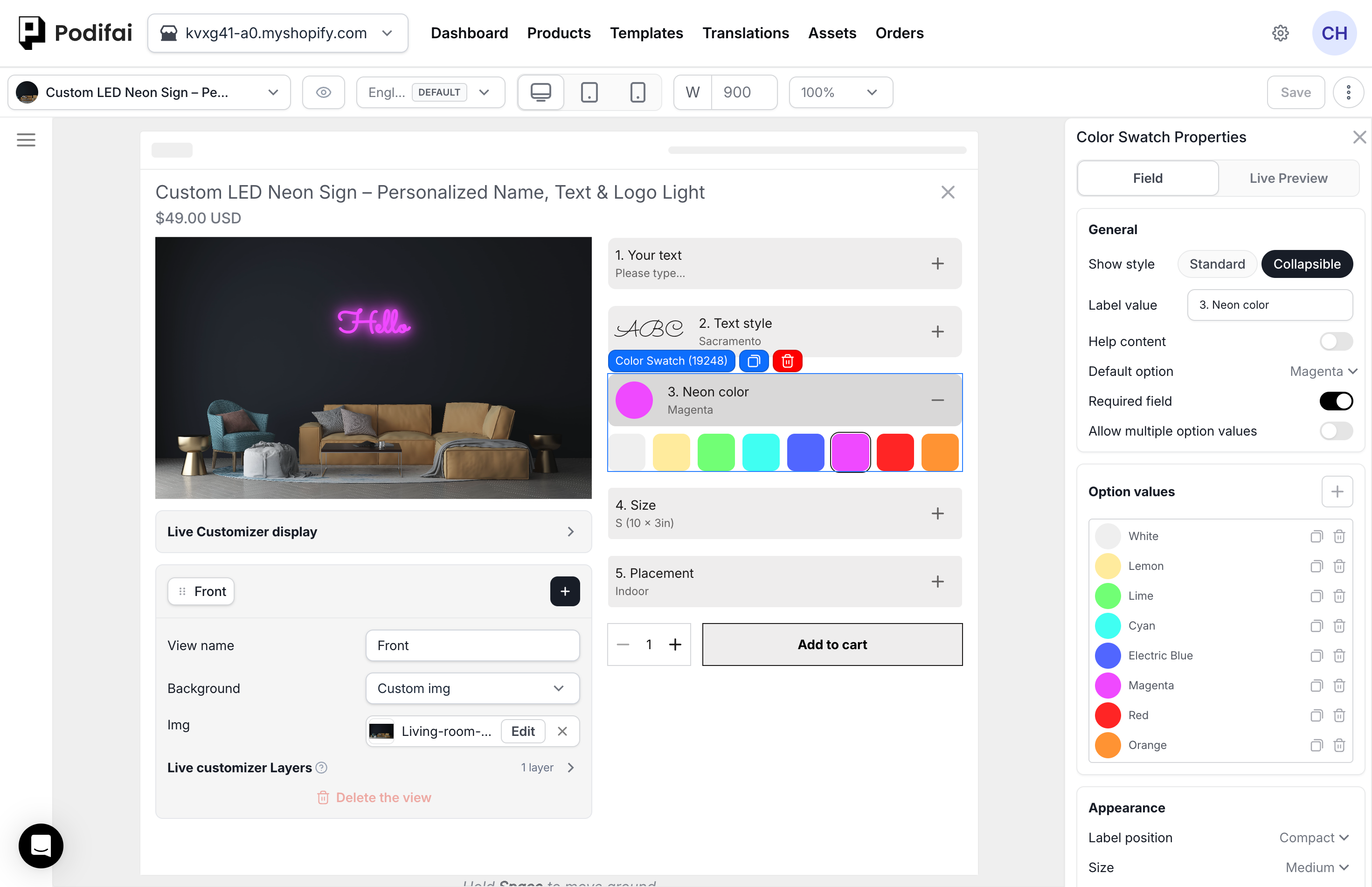
General Settings
- Label value — The option group title (e.g. "Choose Color")
- Required field — Whether a selection is mandatory
- Default option — Pre-selected color when the page loads
- Help content — Hover or popup guidance.
- Allow multiple option values — Let customers select more than one color
Option Values
Each value needs a name and a color. You can duplicate or delete values. Additional settings per value:
- Color — Hex code (e.g.
#0077B6) or a CSS gradient (e.g.linear-gradient(45deg, #f00, #00f)) - Preview Image — Image displayed in Live Preview when this color is selected
- Price adjustment — Optional surcharge for premium colors
- Track inventory — Link to a Shopify variant for stock tracking
Appearance
- Size — Set swatch dimensions.
- Radius — Set corner rounding.
- Label position — Choose the label layout.
- Selected outline thickness — Set the selected-state outline width.
- Selected outline offset — Set the gap around the selected swatch.
- Selected outline color — Set the selected-state outline color.
Conditional Logic
Use Conditional Logic to show or hide this option based on another selection. For example, show different color sets based on the chosen material.
If the Intended Preview Color Does Not Change
- Text or effect color: Select the text layer, check Live Preview is enabled, and confirm that the intended color control links to the correct Color Swatch.
- Image layer: Check Live Preview on the Color Swatch and the Preview Image assigned to each value, then review the layer's position and size.
- Stocked product color: Check the selected Shopify variant and its image if the background uses Variant image.
Test each color against the product background for readability. When text and effect colors have separate controls, change each one independently to confirm that it updates the intended part of the preview.
FAQ
Can Color Swatch change live preview text color?
Yes. Add a Color Swatch option, then select the Text Input or Text Area option and use Link color swatch. The text option owns the live preview layer, and the Color Swatch provides the color value.
Does Podifai have a storefront color picker?
Not currently. Color Swatch lets shoppers choose from predefined colors. Podifai does not currently provide a free-form storefront color picker where shoppers can choose any custom color.
Can Color Swatch directly change product images in Live Preview?
Yes. Turn on Live Preview and assign a Preview Image to each Color Swatch value. When a shopper selects a color, its Preview Image appears in the configured preview layer.
Can Color Swatch use inventory?
Yes. Color Swatch values can link to Shopify variants for stock tracking when each color choice should follow product or variant availability.