Change the Look
Style your Podifai customizer with global colors and fonts, option layouts, tooltips, and button text. Review language settings separately.
Last updated: 2026-11-06
Overview
Podifai inserts its own UI blocks on your product pages. Use Global Settings for shared interface colors and fonts, and each option's appearance controls for its size, borders, and layout. Global Settings apply across products with Podifai options; option-level controls configure the selected option.
Global Style Settings
Open a product customizer from the Products page, then use the Global Settings panel to adjust shared colors and fonts. If the right panel shows an option's properties, click an empty area outside the options to return to Global Settings.
Open Global Settings to style your customizer
Colors & Shades
Podifai uses two color groups to style the options UI:
- Primary color — Used for selected states, accents, and active highlights. When a customer clicks a swatch or badge, the selection indicator uses this color. Pick a color that matches your brand's accent color.
- Neutrals — Sets the shared neutral palette used for labels, descriptions, borders, and backgrounds. Change the Neutrals in Global Settings and check the resulting shades in your customizer. Lightest, Light, Medium, and Dark are not four independently editable color controls in this panel.
Check text readability against your store's actual background in both Inline and Popup modes. Changing Neutrals can affect several interface elements together. If you need a label and its description to use independent colors that the available style controls do not provide, use the chat icon on the left side of the page or email chelsea@podifai.com to discuss a theme-specific CSS adjustment.
The Popup background color has no setting. See Change the Whole Popup Background.
Font
Set the default font family for option labels and text. You can choose from:
- Theme font — Use the same font as your Shopify theme for a consistent look. Theme fonts appear only on your storefront, not in the Podifai editor.
- Google font — Pick any Google Font by name
- Upload — Upload your own font files
You can select and upload multiple Global Font files at once. Each file can be a TTF, OTF, WOFF, or WOFF2 file up to 5 MB. The same batch upload, formats, and per-file limit apply when uploading fonts for Font Swatch values. Shoppers can select one font at a time from a Font Swatch.
The global interface font styles option labels and interface text. To let shoppers choose the font used by their personalization preview, add a linked Font Swatch to the Text Input or Text Area instead.
Storefront Settings in Global Settings
Below Global color and Global font, Global Settings groups shared storefront behavior into cards. These settings apply to every product in the store. Click Save changes at the bottom of the panel after changing them.
- Live preview
- Show preview — On page load (default) or After 1st change. See Choose when Live Preview appears.
- Focus areas — Highlight the focused customization area and dim the rest of the preview. Clicking or tapping an area scrolls its related customization options into view.
- Enable live preview zoom — Let shoppers zoom in and pan around the Live Preview image.
- Fields/options
- Enlarge option images — Show a larger image when shoppers hover over Image Swatch values or options with a leading image. Color and Font Swatches are not affected. This is separate from Live Preview zoom.
- Out-of-stock options — Choose Disable to keep out-of-stock linked-variant values visible but unavailable, or Hide to remove them from the shopper's option list.
- Add to cart & orders
- Cart behaviour — For the Popup customizer, choose Redirect to cart page after Add to Cart, or Follow theme default to use the Shopify theme's normal cart flow. Inline customizers always use the theme's cart behavior.
- Generate print-ready files — See Print-ready files.
- Popup customizer
- Popup header — With product title shows the product title and price; Minimal shows “Customize” and moves the total price above the Add to cart button.
- Quantity selector — Show or hide the product quantity selector inside the Popup customizer.
- Other
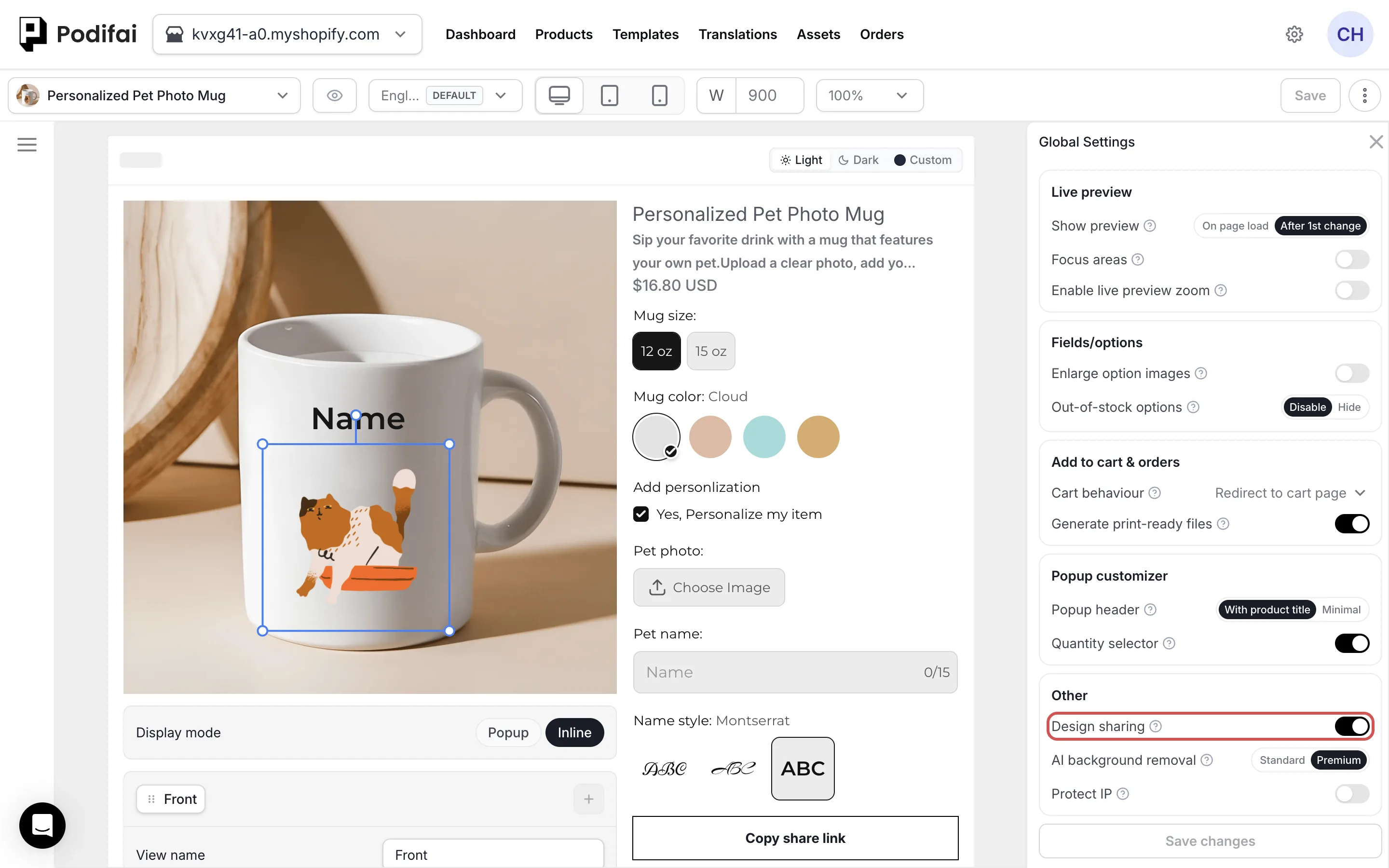
- Design sharing — Let shoppers share a link to their design. See Customizer sharing.
- AI background removal — Standard (default) or Premium. See Background removal.
- Protect IP — Prevent visitors from using the storefront's normal right-click save-image action on Podifai preview images.
Supported Styling
Use Podifai's built-in Global Settings and option appearance controls to style your customizer. For a change those controls do not provide, use the chat icon on the left side of the page or email chelsea@podifai.com with your product URL and the desired result. Theme-level CSS or code changes can produce inconsistent results across devices and may stop working after a theme or app update.
If a Podifai setting looks different on desktop and mobile, confirm the setting in the Podifai editor first. If the difference remains, send us your store URL, product URL, theme name, device and browser details, and screenshots from both devices so we can check the theme compatibility issue. See the Troubleshooting guide for the support checklist.
Customize Button Text
Change the text on the storefront Customize button to wording such as Personalize or Design Yours. Click the edit (pencil) icon beside the Customize button in the editor and enter your wording in Button text. The same panel sets Before add-to-cart (required or optional personalization) and the button's colors. See Customizer Display Modes for the full steps.
Customizer Language
Podifai supports translations for system messages and custom options, including labels, values, help text, button labels, and view names. Open Translations in the Podifai menu, add a published Shopify language, then edit translations manually or use AI Auto Translation. AI translation is included on every plan at no extra fee; see Multiple Languages & Translations.
Preview Light, Dark, or Custom Backgrounds in the Editor
Use Light, Dark, or Custom at the top of the editor preview to inspect how the customizer looks against different backgrounds. These controls only change the editor's visual preview. They do not configure the live storefront or the whole Popup background.
Change the Whole Popup Background
If you want the entire popup to use a specific brand background color, use the chat icon on the left side of the page or email chelsea@podifai.com with the desired color, product URL, and a screenshot of the area to change. Neutrals is a shared palette; it is not a separate popup-background color control, and Lightest is not an independently editable setting. There is no dedicated setting for the whole popup background. Support can help with a custom code or Liquid adjustment for your storefront.
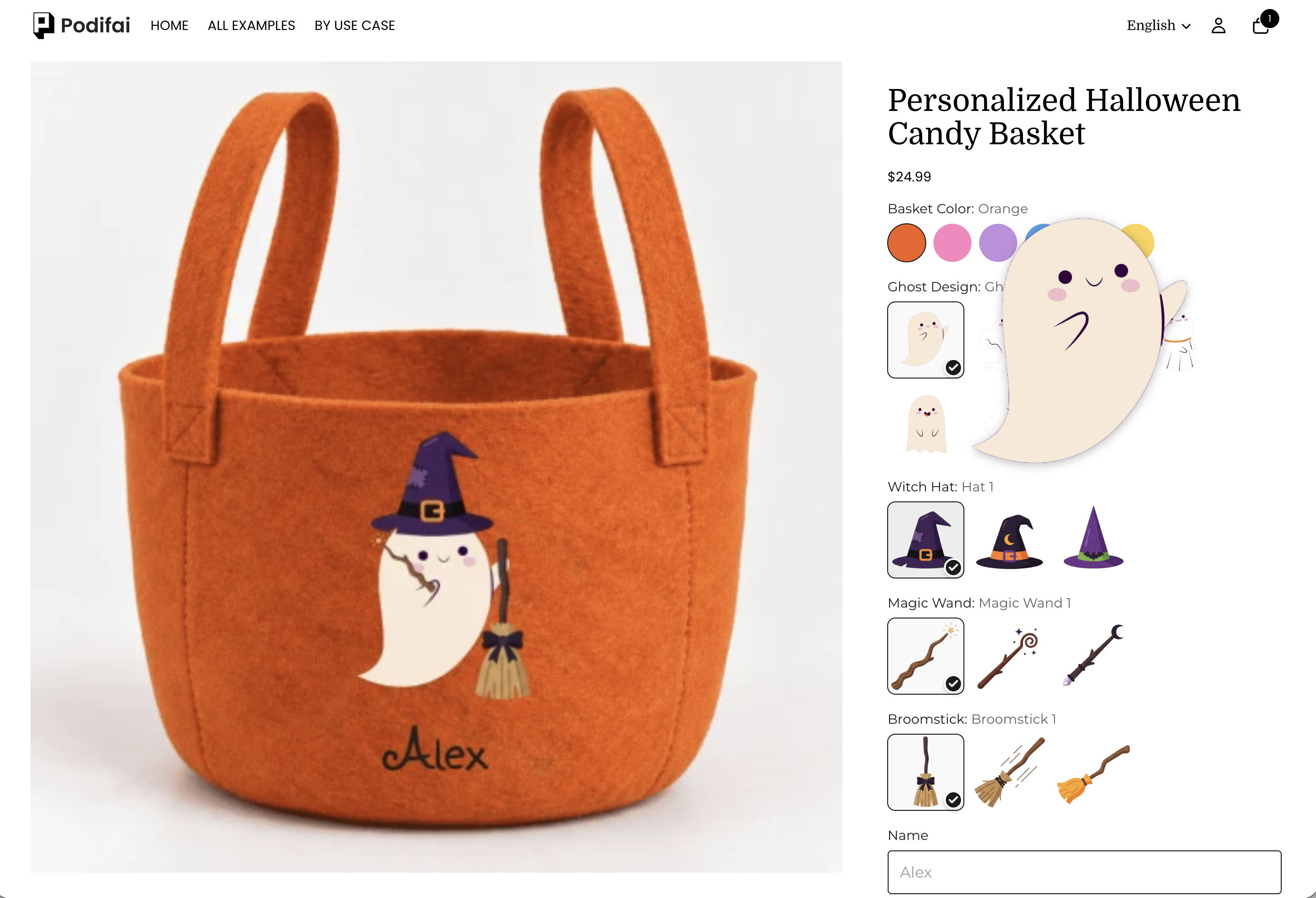
Enlarge Option Images
In Global Settings → Fields/options, turn on Enlarge option images and click Save changes. Hover over an option image to see a larger version beside it.
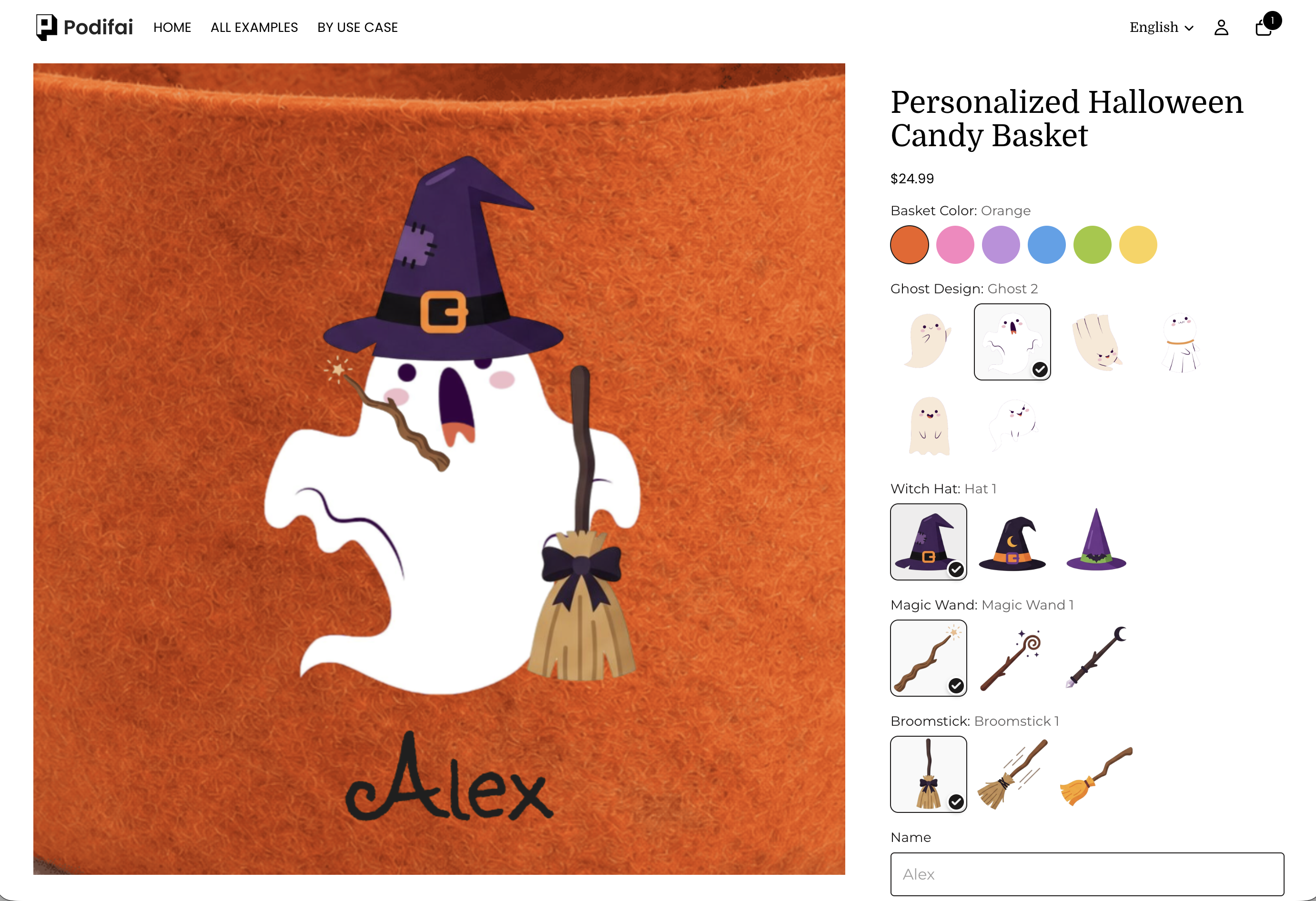
Enable Live Preview Zoom
In Global Settings → Live preview, turn on Enable live preview zoom and click Save changes to let customers inspect the product preview more closely. This magnifies the product preview; Enlarge option images magnifies individual option images.
Focus Areas
Turn on Focus areas under Global Settings → Live preview. On desktop, hovering over a customization area keeps it visible and dims the rest of the preview. On desktop and mobile, clicking or tapping an area scrolls its customization options into view.
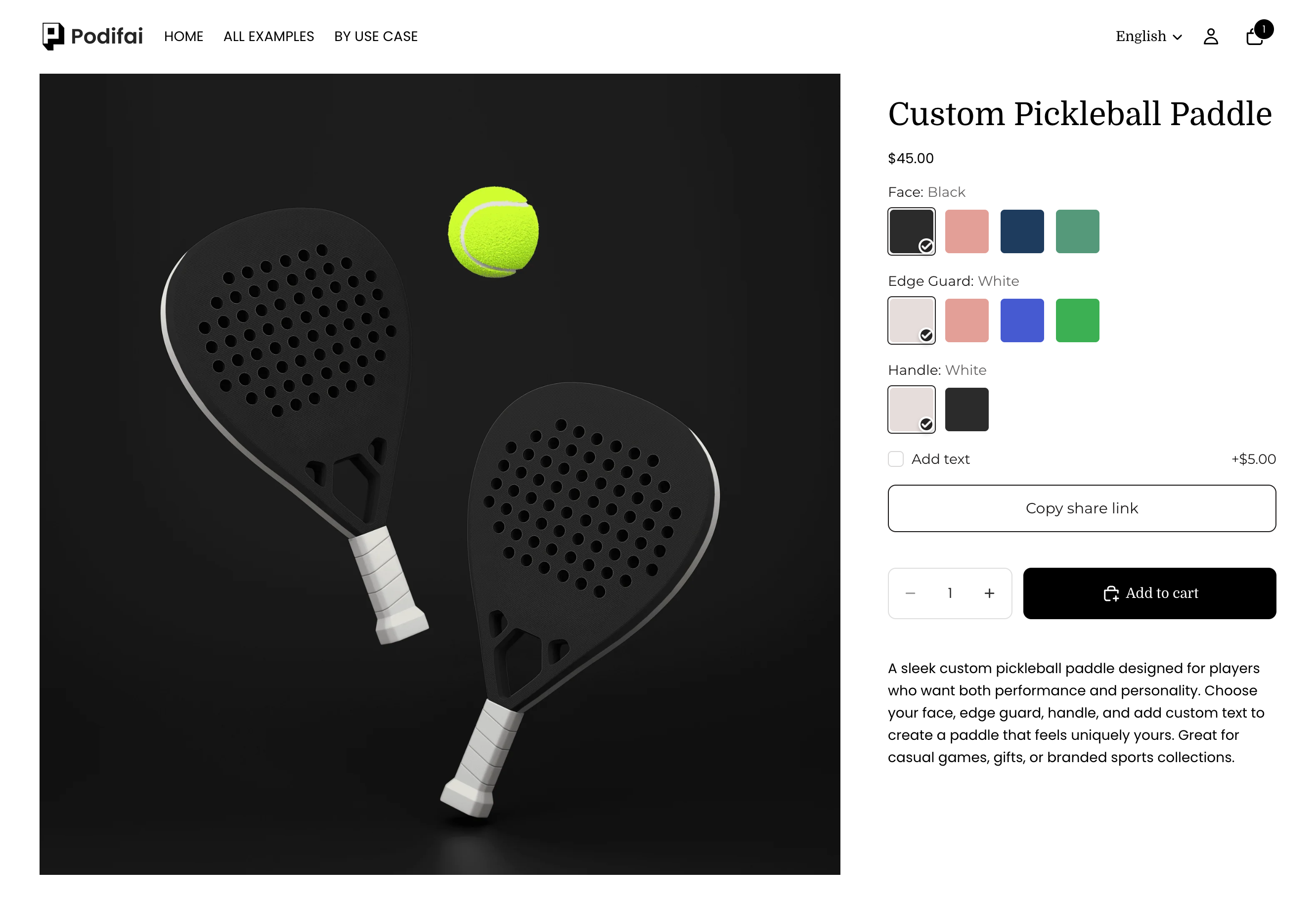
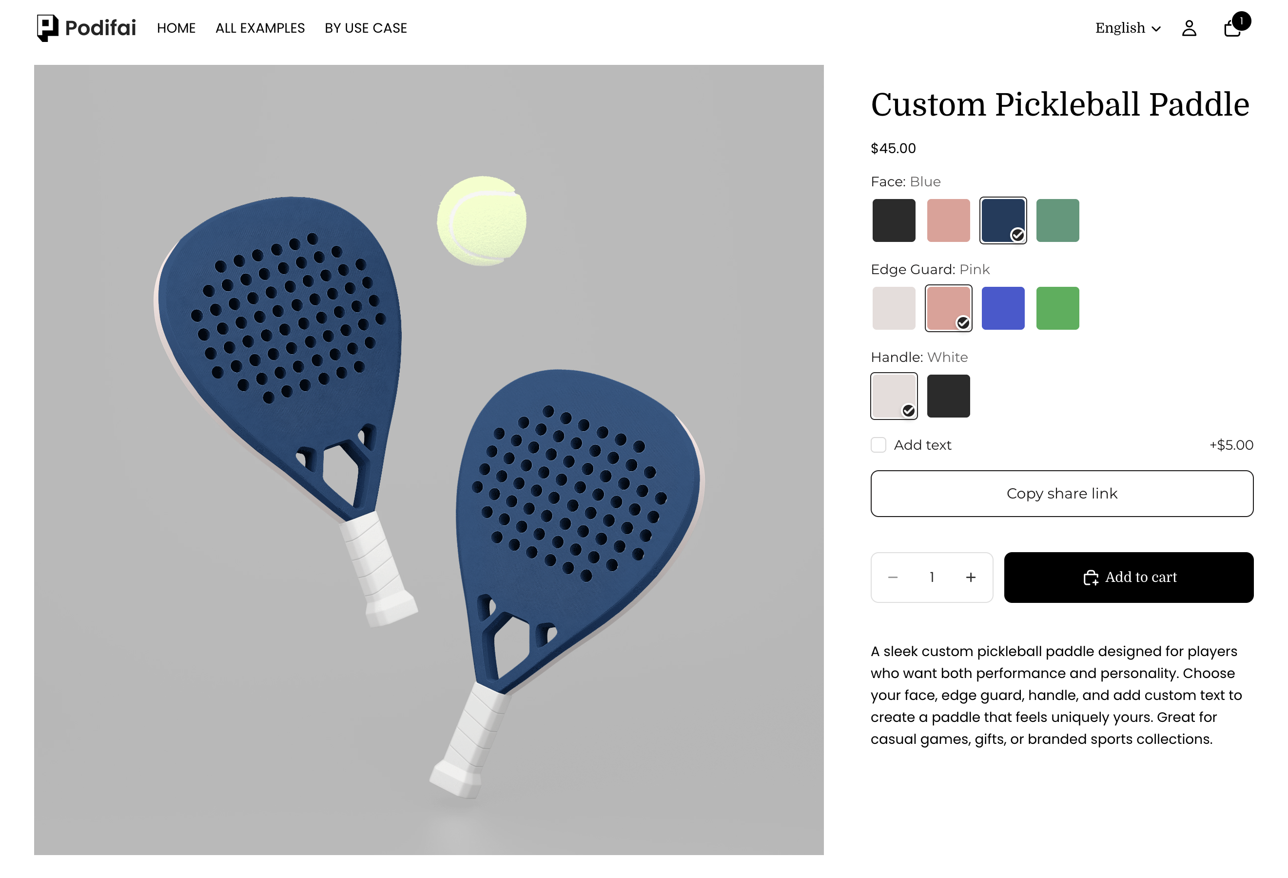
These screenshots use different color selections. The dimmed overlay shows the focus effect; it does not change the selected colors.
Customizer Sharing
In Global Settings → Other, turn on Design sharing and click Save changes. Shoppers can share a link to their selected options.
In the Share your creation! window, click Copy to copy the link. Anyone with the link can open the saved design, customize it, and purchase it.
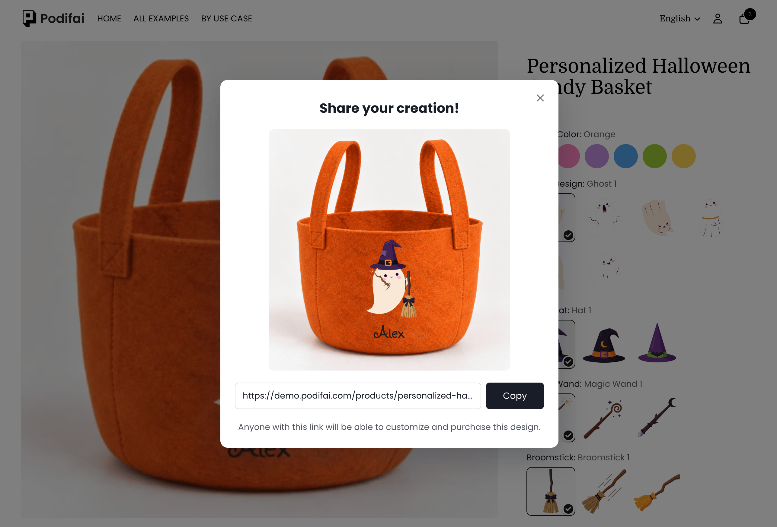
A shared design link is deleted if nobody opens it for 12 months. Each time someone opens the link, the 12 months start again. Photos used only by that design are removed with it.
Tooltips in Standard and Collapsible Options
Help content is available in both Standard and Collapsible show styles.
- Select the option and open Field → General → Help content.
- Enable it and choose Type → hover for a tooltip or popup for an opened help panel.
- Set Label for the help link and Tip for the guidance text.
- To link to another page, fill in Hyperlink text and Hyperlink URL.
- For popup help, use Image → Select Image if you want to include an illustration.
- Save and test how customers open the help content on desktop and mobile.
The help Label is separate from Label value, which names the option itself. Use Help content for sizing instructions, engraving examples, or image-upload guidance.