Text Input
Collect names or engraving text with Text Input. Set character limits, preview placement, font links, and an optional personalization charge.
Last updated: 2026-11-06
Text Input collects short single-line personalization, such as names, initials, dates, or engraving text. It can update Live Preview, work with two-letter or three-letter Font Swatch monograms, align text left, center, or right, use a custom shadow, link to font and color controls, and adjust the price.
Need two lines or a longer message? Follow the Text Area replacement steps.
Overview
Text Input accepts a single line of text. Use it for names, initials, dates, or short custom messages.
How to add a Text Input option
Drag the Text Input block from the option panel into the canvas and drop it where the field should appear. The new option immediately shows up in the live preview.
Live Preview
Text Input supports Live Preview. When enabled, the typed text appears on the product image in real time. Configure font, size, color, and position in the preview layer settings. Pair with a Font Swatch to let customers choose the typeface.
Turn Live Preview on or off for Text Input
Select the Text Input option, open Text Input Properties → Live Preview, and use the Live customizer toggle. When enabled, the entered text appears on the product preview. When disabled, the field still collects the shopper's text without displaying it on the product. To let shoppers adjust the text layer, configure On-canvas image controls in the same tab and choose Allow move, Allow resize, and Allow rotateindependently. The setting uses this label for Text Input as well as image options.
Move the Text Input preview text
Click the preview text on the canvas to select it, then drag the bounding box to a new position over the product image. The coordinates update as you move it.
Resize the Text Input preview text
Select the preview layer and drag a corner anchor outward to enlarge the text or inward to shrink it. The font size scales proportionally as you drag.
Align text and add a custom shadow
Select the Text Input preview layer to choose left, center, or right text alignment. You can use an existing text effect or configure a custom box shadow when you need direct control over the shadow rather than a preset style.
Text color can use a fixed color or a linked Color Swatch. The effect or shadow color can also use its own custom color or linked Color Swatch, so shoppers can control the visible text and its effect color independently.
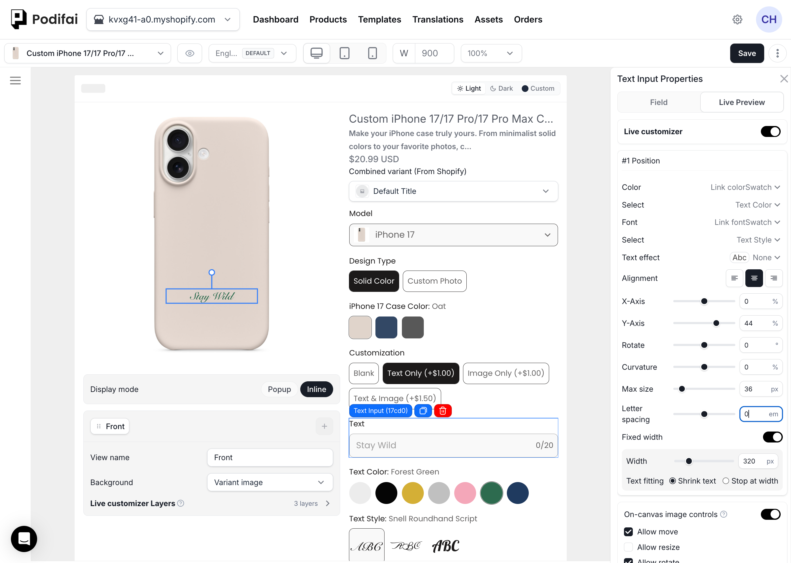
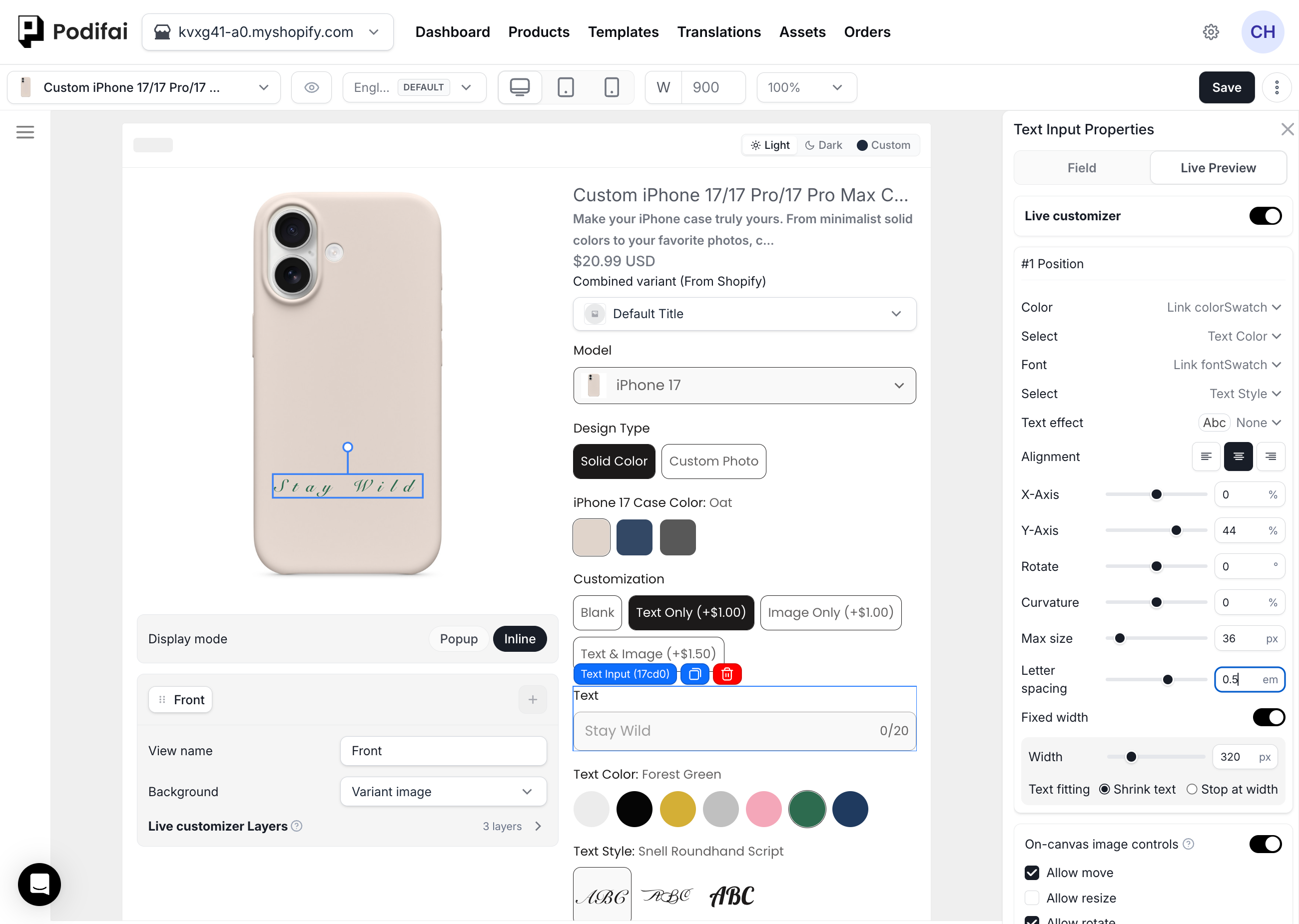
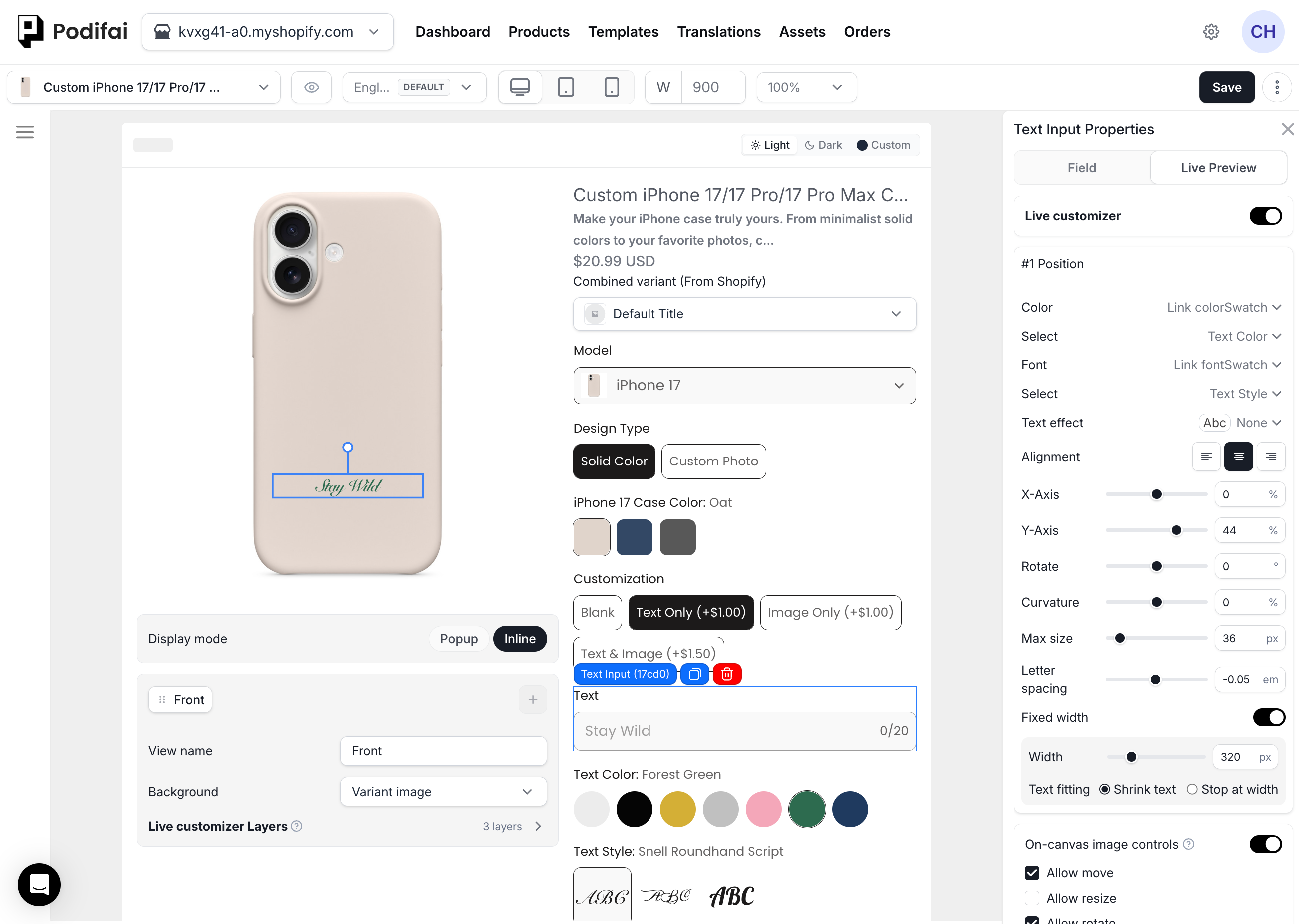
Letter Spacing
Use Letter spacing to change the space between letters in the preview.
- Select the Text Input option.
- In Text Input Properties, open Live Preview.
- Under the position settings, adjust Letter spacing with the slider or enter a value in em.
- Check the preview, then click Save.
- 0 em — Keep the font's normal spacing.
- Positive values — Increase the space between letters.
- Negative values — Bring letters closer together.
These examples use the same text and font. The values are examples, not required settings. Check spacing again when you change the font or text.
Fixed Text Width and Automatic Resizing
Use fixed text width when shopper-entered text must stay inside a defined engraving, printing, or personalization area. With Shrink text, automatic resizing adjusts the preview text to fit that width as the shopper types.
- Select the Text Input preview layer, turn on Fixed width, and set Width to the width of the target text area.
- Under Text fitting, choose Shrink text (automatic resizing: the font size shrinks as the text gets longer) or Stop at width (the text stops at the width instead of shrinking).
- Choose left, center, or right alignment inside the defined area.
- Set a practical character limit for the physical production area.
- Test short and maximum-length text with every shopper-selectable font.
Fixed width controls the preview layout; it does not replace a character limit or production validation. Different characters and font files can occupy different amounts of space at the same character count.
Example: Short and Long Text in the Same Area
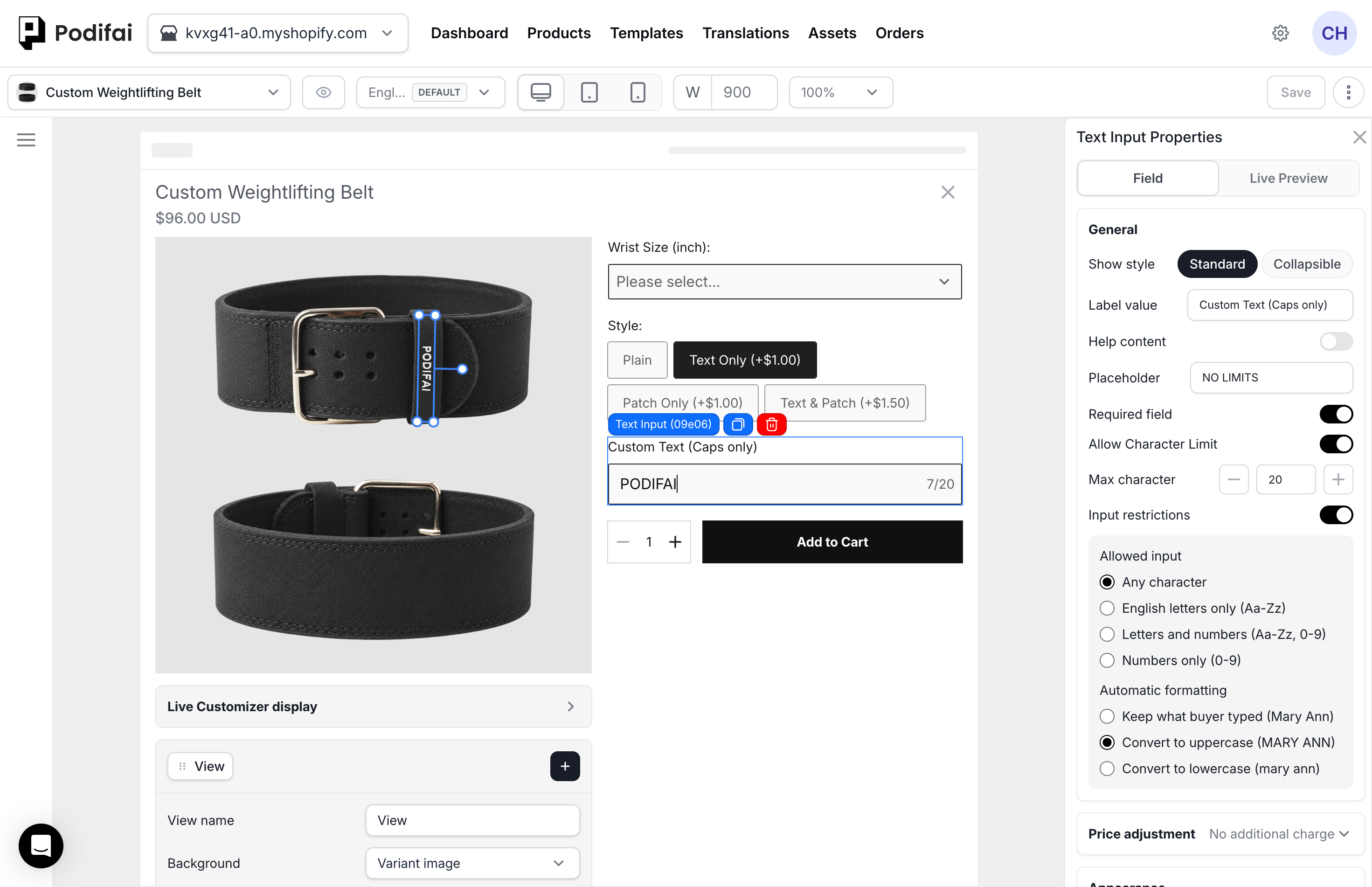
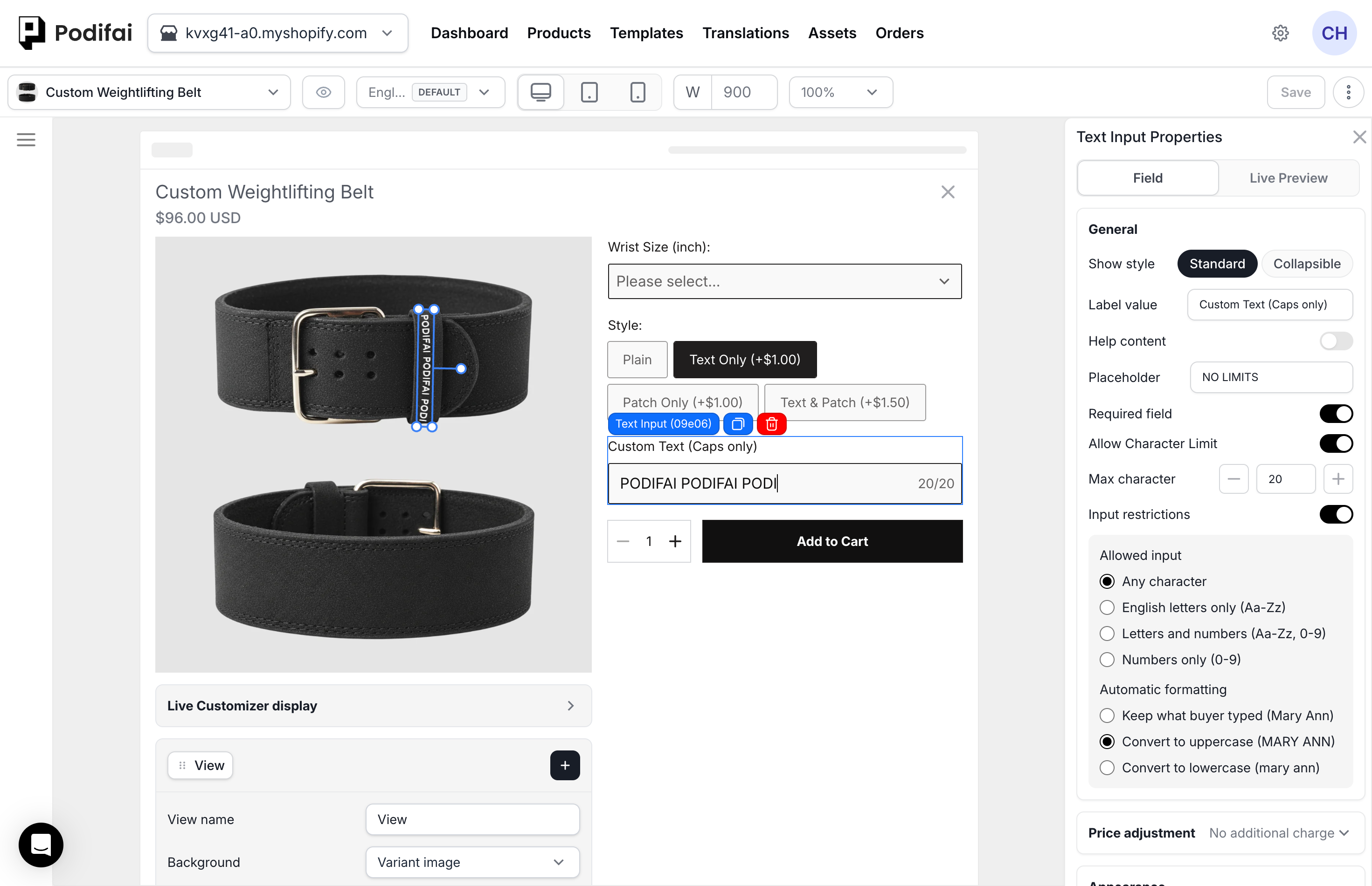
The weightlifting belt uses the same narrow, rotated text area for a seven-character entry and a twenty-character entry. As the text gets longer, automatic resizing reduces the preview font size to fit the defined area. The twenty-character limit shown is this product's setting.
Two-Letter and Three-Letter Monograms
Monogram mode is configured on a Font Swatch option value, then linked to this Text Input. Choose Two letters or Three letters in the Font Swatch value, adjust each letter's size scale and the overall letter spacing, and review the result in the editor and swatch preview.
- Create a Font Swatch value and change Font mode from Single Font to Monogram.
- Choose the Two letters or Three letters layout and adjust its letter scales and spacing.
- Link the Font Swatch to this Text Input.
- Set the Text Input character limit to 2 or 3 so it matches the selected monogram layout.
- Test each Font Swatch value and the exact character count on the storefront.
Let Shoppers Insert SVG Icons with Text
Select the Text Input, open Field → General, and turn on Enable icon selector. Choose the built-in SVG icons you want to offer, or use Select SVG to upload your own SVG files. Save, then focus the text field on the storefront and test inserting the available icons alongside text. The same setting is available for Text Area.
Text and SVG icons inserted with this selector are included together in the print-ready PNG. Enable Generate print-ready files before ordering and make sure valid print data is saved during Add to Cart. The SVG icons are flattened with the text into the PNG; Image Swatch artwork remains excluded. See text icons in print-ready files.
This selector offers the SVG artwork you configure. It does not select a second font for part of the text or provide every device's emoji keyboard. Check the exact text, icons, character limit, and order output your production workflow needs before launch.
Icons follow the text size and color. Select SVG opens the image library in SVG-only mode. Adding an SVG makes it available in the editor icon list; select the icons there to offer them below the shopper's text field.
General Settings
- Label value — The field label (e.g. "Enter your name")
- Required field — Whether the field is mandatory
- Help content — Hover or popup guidance.
- Allow Character Limit — Enable the limit, then set Max character
Set the Text Input label
Select the option in the editor, then type a new value into the Label value field in the right-side settings panel. The storefront preview updates as you type.
Make Text Input required
Toggle the Required field switch on in the option settings. Shoppers will not be able to add the product to the cart until they have filled in the field.
Set a Text Input character limit
Turn on Allow Character Limit, then enter Max character to cap how many characters the shopper can type. The storefront input enforces the limit and shows a counter when the value is close to the cap.
Check the Configured Limit on the Storefront
Enter text longer than your configured limit and check the resulting field value. The tumbler demo limits its text field to 15 characters. This is a product configuration, not a universal Podifai character limit. For a monogram, set the limit to the number of letters (for example 2 or 3).
Check the maximum-length text in the preview with each available font. After adding the product to the cart, confirm that its text property matches the value shown in the field.
Input Restrictions and Automatic Formatting
Under Field → General, turn on Input restrictions to choose Any character, English letters only (Aa-Zz), Letters and numbers (Aa-Zz, 0-9), or Numbers only (0-9). Automatic formatting can keep what the buyer typed, convert it to uppercase, or convert it to lowercase. In the belt screenshots, Any character is selected with Convert to uppercase enabled.
Placeholder and Price
Text Input does not have predefined option values — the customer types their own text. Additional settings:
- Placeholder Text — Example text shown in the input field before typing
- Price adjustment — Fixed or percentage increase or decrease. Add variant price (Bundle variant) is not currently supported
Change Text Input placeholder text
Type your example text into the Placeholder field. The storefront input shows it in faded grey until the shopper starts typing, at which point it disappears.
Add a fixed surcharge to Text Input
A fixed increase is one available pricing setup. Select Increase by fixed amount and enter the amount. Whenever the shopper fills in the text input, that amount is added to the configured price.
Appearance
- Size — Set the input size.
- Radius — Set corner rounding.
- Fill & outline — Choose the fill and outline style.
- Selected outline color — Set the selected-state outline color.
- Focused outline color — Set the outline color when the field is focused.
Change Text Input corner radius
Use Radius in the appearance settings to round or sharpen the input field outline. The change is reflected in both the editor preview and the live storefront.
Conditional Logic
Use Conditional Logic to show or hide this option based on another selection. For example, show the name field only when "Add personalization" is selected.
FAQ
Can I change Text Input into a two-line field?
Use a new Text Area for two or more lines. An existing Text Input cannot be converted directly. Reconfigure the new field and check its preview, linked controls, conditional rules, and pricing before replacing the old field.
When should I use Text Input?
Use Text Input for short single-line personalization such as names, initials, dates, numbers, or engraving text.
Can Text Input appear in Live Preview?
Yes. When Live Preview is enabled, the shopper's typed text appears on the product image in real time.
Can Text Input be used without Live Preview?
Yes. Turn off Live Preview for the option. The text field still appears on the storefront and the shopper's text is still saved with the order.
Can Text Input use Font Swatch or Color Swatch?
Yes. Text Input can link to Font Swatch for font selection and Color Swatch for predefined text color selection.
Can Text Input add a price?
Yes. Text Input supports fixed or percentage increases and decreases. Add variant price (Bundle variant) is not currently supported for this field. The adjustment applies when the shopper fills in the field.
Can I align preview text left, center, or right and add a custom shadow?
Yes. Text preview layers support left, center, and right alignment. You can also configure a custom box shadow and shadow color instead of using only the preset text effects.
Can preview text stay inside a fixed-width area?
Yes. Fixed text width keeps shopper-entered text inside a defined preview area, and automatic resizing adjusts the preview text as its length changes.
Does Text Input support two-letter and three-letter monograms?
Yes. Configure Two letters or Three letters in a Font Swatch value's Monogram mode, then link that Font Swatch to the Text Input. Set the Text Input character limit to match the monogram length.