
Image Swatch
Set up Image Swatch choices, distinguish multiple selection from quantity per option, and configure Multiple position for the live preview.
Last updated: 2026-11-06
Image Swatch lets shoppers choose product options from visual thumbnails, such as materials, patterns, charms, colors, finishes, or prepared design images.
Overview
Image Swatches display options as clickable thumbnail images. Ideal for showing patterns, materials, designs, or decorative graphics visually.
For choices that define the base product SKU, stock, or base price, use Shopify variants. Swatch selections collect customization data; an inventory link for an add-on is separate from selecting the base product variant. See Shopify Variants vs Podifai Options.
How to add an Image Swatch option
What this shows
- Drag Image Swatch into the editor.
- Name the option group.
- Add visual values for shoppers to choose from.
Live Preview
Image Swatch supports Live Preview. When enabled, selecting an image swatch updates the product image in real time — for example, switching between fabric patterns or product colors. Configure the preview layer position and size in the editor.
Set up Live Preview for Image Swatch
What this shows
- Select the Image Swatch, open Image Swatch Properties > Live Preview, and enable Live customizer.
- Upload or select the preview image for each value.
- Position the preview layer on the product image.
To present the preview inside a specific shape, choose a built-in mask or upload a custom PNG mask. See Image Masks.
Turn off Live Preview for one Image Swatch
Let Shoppers Move, Resize, or Rotate Images
Select the Image Swatch in the custom option form, open Image Swatch Properties → Live Preview, and enable Live customizer. Scroll within this tab to On-canvas image controls. Turn it on and select Allow move, Allow resize, and Allow rotateindependently, then save. These settings apply to this Image Swatch's preview images.
For multiple selections, choose Multiple position → Mode → Drag freely for free placement, or Drag & snap for predefined slots. See Charm Builder for examples and on-canvas image controlsfor the full setup. Inline or Popup display mode does not choose these permissions.
General Settings
- Label value — The option group title shown to customers (e.g. "Choose Pattern")
- Required field — Whether a selection is mandatory before adding to cart
- Default option — Pre-selected value when the page loads
- Help content — Hover or popup guidance.
- Allow multiple option values — Let customers select more than one swatch
- Allow quantity per option — Let customers add repeated units of a swatch value
Change the Image Swatch label
Set the default Image Swatch option
Group Options and Search
Organize values within one Image Swatch field into named groups, such as Birthstones, Letters, and Symbols. Shoppers can browse the group tabs or search for a choice. Group options is available only for Image Swatch and Checkbox. Other custom option types do not have this setting.
- Select the Image Swatch field and open Properties → Field → Option values.
- Turn on Group options. Existing values appear in the first group.
- Enter a Group name. Use the plus beside the group tabs to add a group, then the plus beside its name to add values to it. You can create up to 10 groups per field.
- Use distinct, nonempty names and drag group tabs to arrange their order.
- Enable Show “All” tab to offer a tab containing all values.
- Enable Show search bar and edit its Placeholder to explain what shoppers can search for.
- Save, reopen the editor, and check the product on your storefront in the display mode you use.
For a Charm Builder, group a larger collection into Birthstones, Letters, and Symbols so shoppers can find a charm and combine it with choices from other tabs in the same design.
How Group Tabs and Search Work
With an empty search, a group tab shows that group's values. A search checks option labels across all groups, including when another group tab is active. Clearing the search restores the active group. Switching tabs or searching does not remove choices already selected in another group.
Groups organize the choices within the same field. Configure Required field, Allow multiple option values, and Allow quantity per optionseparately. Selection and total quantity limits apply across the field's groups; each tab does not receive a separate allowance.
Manage Groups Safely
Select a group and use Delete below its values to remove it. Deleting a populated group also deletes its values; review the confirmation before continuing. To show a flat list while keeping the grouping configuration, turn off Group optionsinstead. Save and reopen before checking the storefront.
This feature groups values inside one field. The editor's Container / Option Grouporganizes multiple fields and is a separate feature.
Choose Multiple Selection or Quantity per Option
Open Image Swatch Properties → Field → General to choose how customers select values. These controls set what they can select and how it is counted. Configure the images' placement separately in Live Preview → Multiple position.
| Selection behavior | Field settings | What the limits count |
|---|---|---|
| Different values, once each | Allow multiple option values on; Allow quantity per option off | Min selections / Max selections count distinct selected values. |
| Repeated units of a value | Allow quantity per option on | Min quantity / Max quantity apply to each value. Min total quantity / Max total quantity apply to the sum of all selected units. |
Allow Multiple Option Values: Choose Different Designs
Turn on Allow multiple option values and leave Allow quantity per option off. For a Halloween basket, set Min selections to 1 and Max selections to 2 to let shoppers choose one or two different ghost designs. Ghost 1 plus Ghost 2 counts as two selections. Each design can be selected once. Selected swatches are marked without selection-order numbers, and the Live Preview shows only the selected designs. Unused positions are hidden.
Allow Quantity per Option: Repeat a Design
- Select the Image Swatch and open Field → General.
- Turn on Allow quantity per option. Allow multiple option values is turned on and locked while quantity mode is on; shoppers can still add different values.
- Under Quantity per option, configure Min quantity and Max quantity as needed.
- Under Total quantity, configure Min total quantity and Max total quantity. Minimum controls depend on Required field.
- Save and check adding, increasing, decreasing, and removing values on the storefront, including the configured limits.
For example, allow 0–10 units of each ghost design and 0–20 units in total. Ghost 1 × 3 plus Ghost 2 × 2 counts as five units across two different designs. Shoppers use Add and the quantity controls below each value. A 1/20 counter means one selected unit out of the configured total maximum of 20. These limits are an example, not product defaults.
For example, two copies of the same charm count as two toward the total. A fixed $4 increase for that value contributes $8 when its selected quantity is two. The product quantity selector controls the number of complete products ordered; it does not set the number of charms inside each product.
With quantity per option off, multiple selection chooses different values once each. Use Min selections and Max selections for that mode. Quantity mode uses its per-option and total quantity controls instead. If you link stock, verify actual order deductions separately using the inventory checklist.
Option Values
Each value needs a name and an image. You can duplicate or delete values as needed. Additional settings per value:
- Image — Upload a PNG, JPG, JPEG, WebP, or SVG thumbnail image for the swatch, up to 2 MB
- Price adjustment — Optional surcharge for this selection
- Track inventory — Link to a Shopify variant for stock tracking
Upload thumbnail images for Image Swatch values
What this shows
- Open the option value settings.
- Upload one PNG, JPG, JPEG, WebP, or SVG image for each value, up to 2 MB per image.
- Use clear thumbnails that shoppers can distinguish quickly.
Appearance
- Fit — Choose Fill or Fixed for the swatch layout.
- Size — Set thumbnail dimensions.
- Radius — Set corner rounding.
- Fill & outline — Choose the swatch fill and outline style.
- Label position — Choose the label layout.
- Selected outline color — Set the selected-state outline color.
Change Image Swatch size
Adjust Image Swatch padding
Change Image Swatch corner radius
Change Image Swatch style
Conditional Logic
Use Conditional Logic to show or hide this option based on another selection. For example, show pattern options only when a specific product style is selected.
See Image & Asset Requirements for the 2 MB thumbnail and preview limits, recommended formats, dimensions, and performance guidance.
Build a Charm or Component Customizer
Image Swatch can power a charm, patch, bead, sticker, or component builder. Choose ordinary multiple selection for different values once each, or quantity per option for repeated units. Set the matching limits in Field, then configure Multiple position in Live Preview. Each value can also have its own price adjustment and linked Shopify variant inventory.
See Charm Builder for the complete preview, pricing, inventory, asset, and testing workflow.
Ordinary Multiple Selection and Validation
With Allow quantity per option off, shoppers can temporarily select fewer than Min selections or more than Max selections while editing. Podifai displays a warning and still lets them add or remove values. Final validation blocks submission when the selection is below Min selections or above Max selections.
With Allow multiple option values enabled and Drag & snap configured under Live Preview > Multiple position, shoppers can drag an unselected charm from the option list onto the preview to fill an empty slot. At the selection limit, dropping an unselected charm onto a filled slot replaces that charm. To swap selected charms between slots, drag them directly on the preview. On desktop, hover over a preview charm to reveal its delete control.
For repeated units, use the per-option and total quantity limits. Check those limits with the quantity controls rather than applying the ordinary selection-count rules.
Example: Fill a Chocolate Box
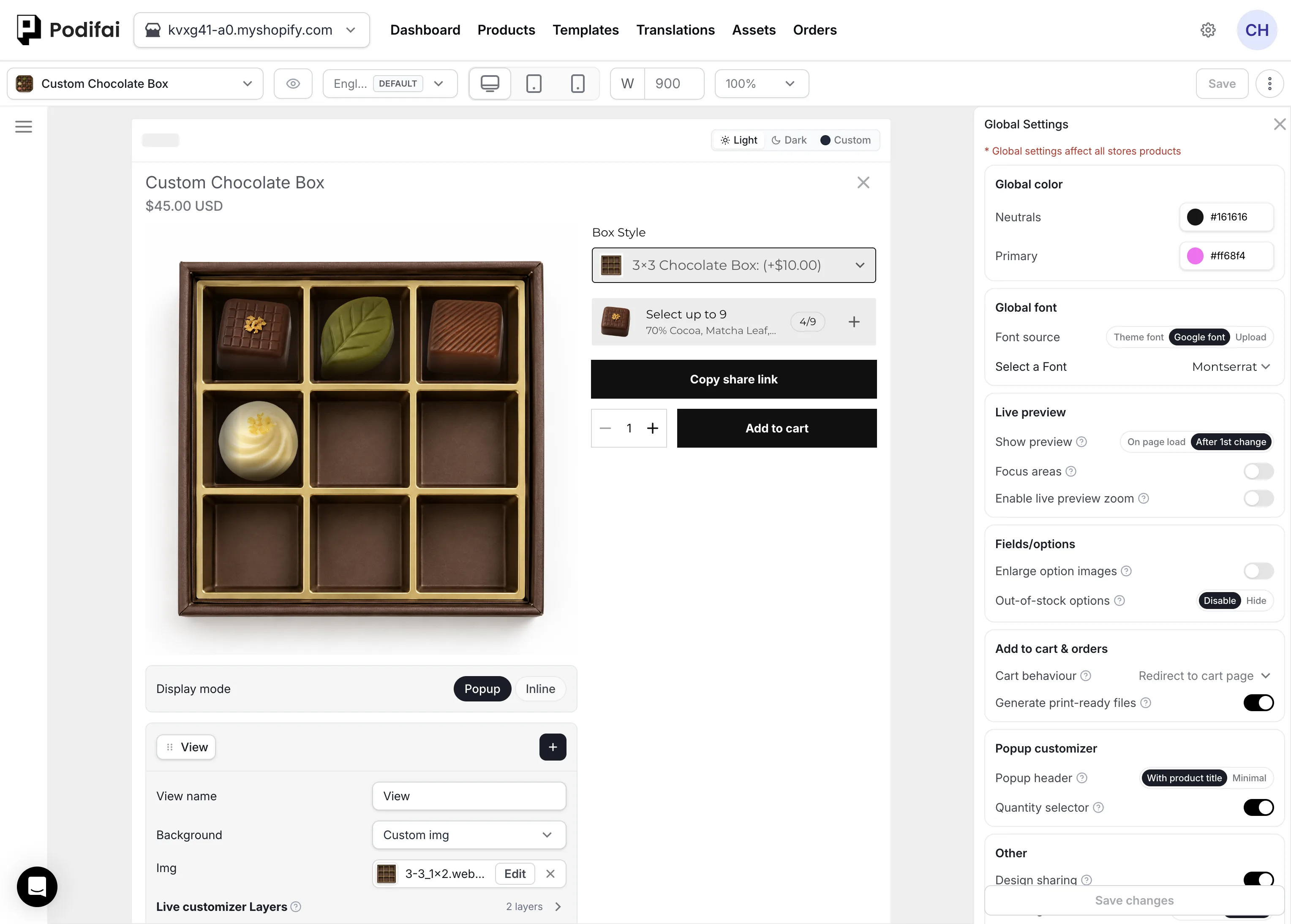
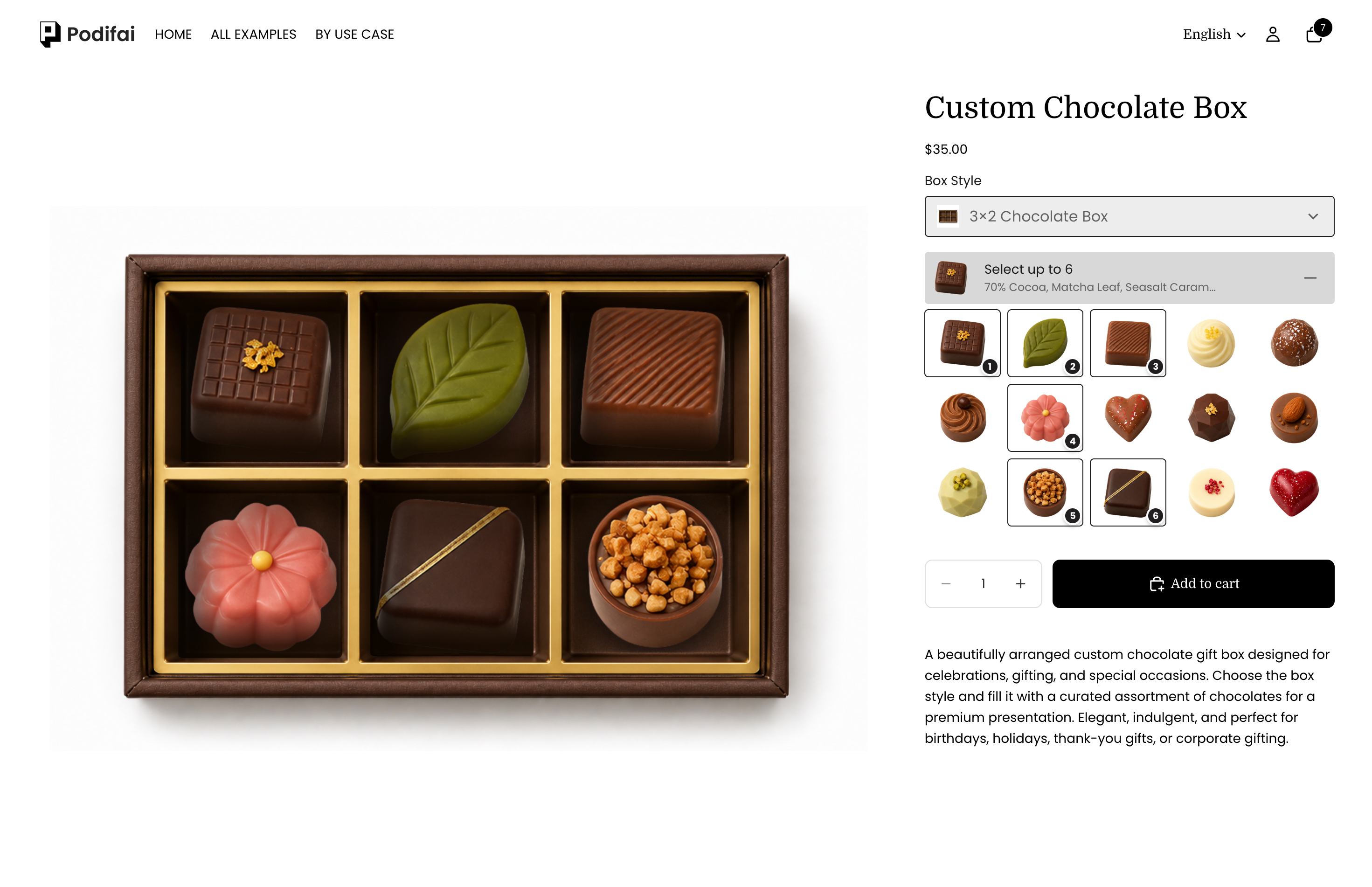
Multiple-selection Image Swatch can also fill a product layout with several selected images. In the chocolate box editor, each position card under Multiple position has its own Width/height, X-Axis, Y-Axis, and Rotate controls. Place the positions over the box compartments, then test the selected chocolates in the storefront preview.
Example: Nine Chocolates with Repeated Flavors
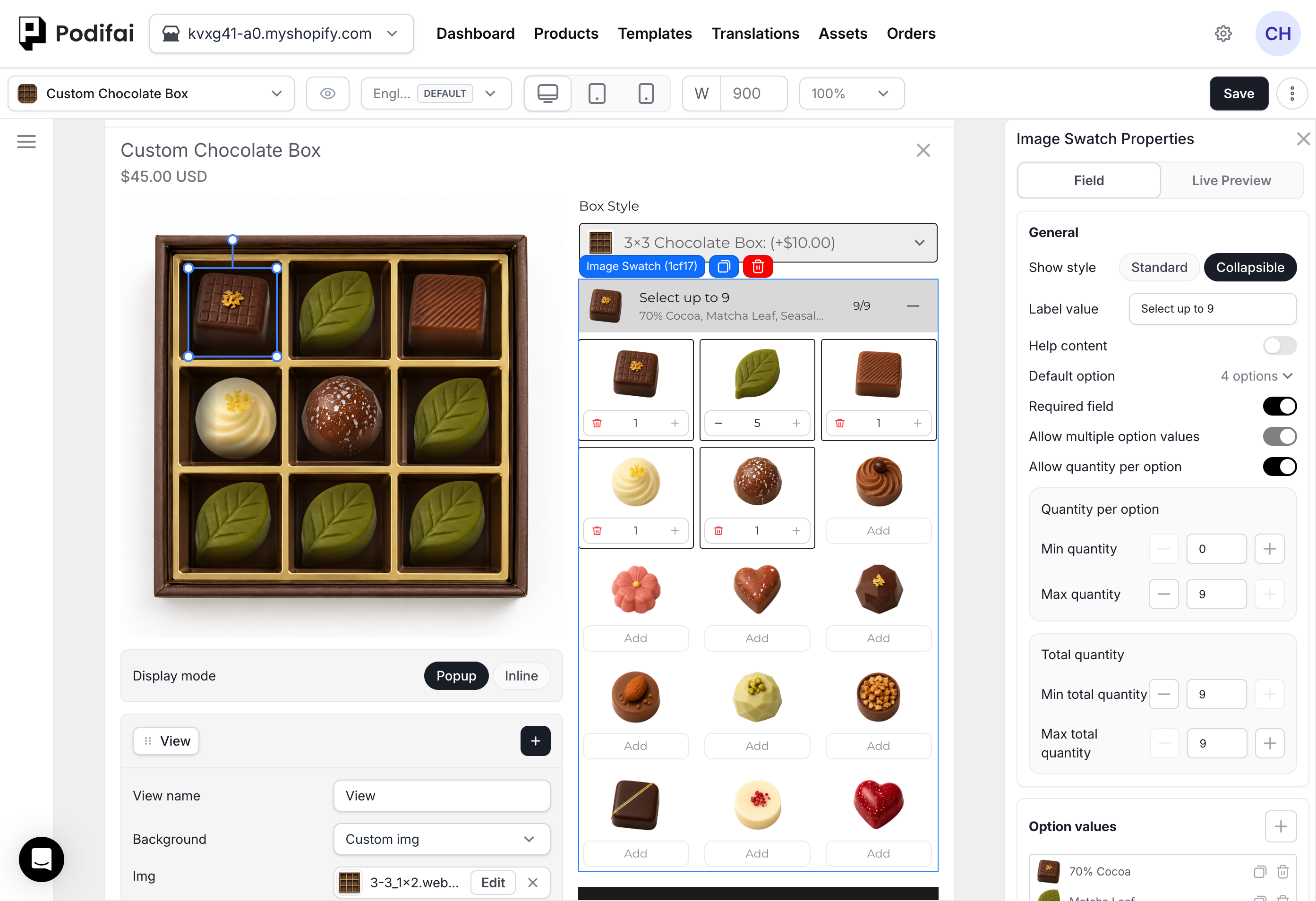
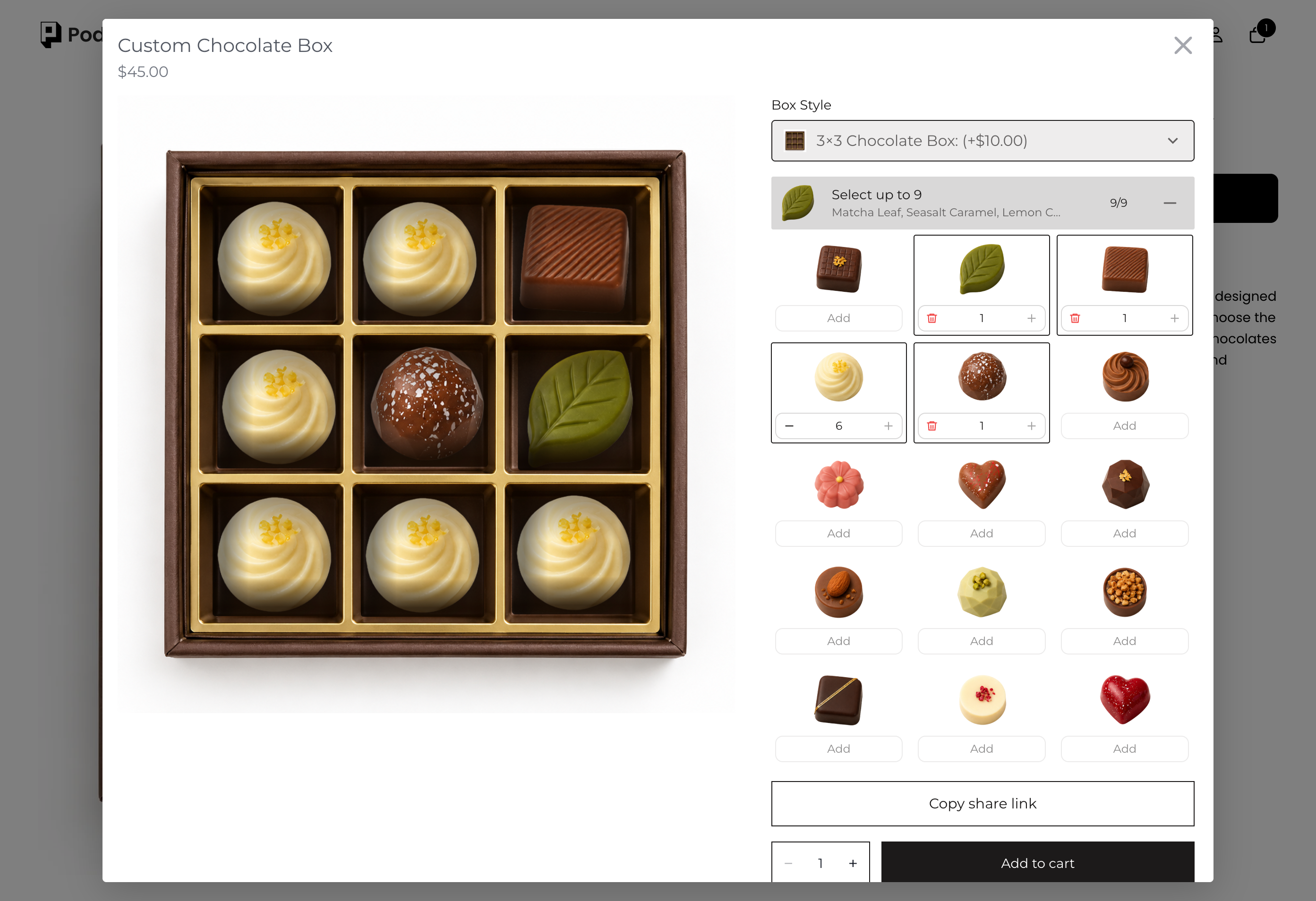
Enable Allow quantity per option. Set each flavor's quantity range to 0–9 and both total quantity limits to 9. Six of one flavor plus one each of three others fills the box. The 9/9 counter counts units, while ordinary multiple selection counts distinct values.
Set a Placeholder Image
Open this option's Live Preview tab and turn on Enable placeholder image. Choose a provided placeholder or add your own image. This setting is available for Image Upload, Image Swatch, Badge Group, Dropdown, and image-enabled Checkbox.
The placeholder appears on the storefront before the shopper selects anything, or when a selected value has no preview image. It does not appear in the editor Live Preview. With multiple selection, every position shows the placeholder until the first selection; after that, unused positions are hidden.
Verify the Image Swatch
- Check each selector thumbnail and its Preview Image; test both when they use different files.
- Check layer placement for every value and each Shopify variant image used as a background.
- With quantity per option off, test below Min selections, within the allowed range, and above Max selections. Confirm final submission is blocked outside the configured range.
- With quantity per option on, test repeated units of one value and a mix of different values. Check the per-option limits, total limits, displayed quantities, and preview as units are added or removed.
- For Multiple position, select, rearrange, remove, and replace values on desktop and mobile.
- Review any value charges and inventory links, then confirm the selected values in the order.
Use Verify Before Launch for the full storefront-to-order checklist.
Color PNG Artwork with Image Coloring
In Image Swatch Properties → Live Preview, enable Image coloring. Choose Link colorSwatch to use a shopper's selected color, or Custom for a fixed color. This colors the Image Swatch artwork; assigning a Preview Image directly to a Color Swatch value is a separate workflow.
- Use white or light grey artwork on a transparent background. Light and dark areas preserve texture and shading; black remains black.
- Colored PNG artwork blends with the chosen color and can look dark or muddy. An opaque white background is colored too, creating a visible box.
- SVG artwork is recolored directly to the chosen color. Neither approach automatically splits a multicolor design into independently editable regions.
Test light and dark choices with your actual artwork. For independent fabric, pattern, or logo colors, see multiple customizable parts.
FAQ
Which option types support Group options?
Only Image Swatch and Checkbox. Enable Group options under Field > Option values to create up to 10 groups per field, with an optional All tab and a search bar that searches labels across all groups.
Can the image in the option selector differ from the image on the product preview?
Yes. Option Image is the selector thumbnail; Preview Image is the artwork displayed in Live Preview. Use the same image for both or assign different images for the selector and the product visualization.
When should I use Image Swatch?
Use Image Swatch when customers should choose from visual options such as materials, patterns, charms, graphics, finishes, or product styles.
Does Image Swatch support Live Preview?
Yes. Image Swatch can update the product preview directly when Live Preview is enabled for the option.
Can customers select more than one Image Swatch value?
Yes. Enable Allow multiple option values. With Allow quantity per option off, set Min selections and Max selections. Shoppers can temporarily select fewer than Min selections or more than Max selections while editing. Podifai displays a warning and still lets them add or remove values. Final validation blocks submission when the selection is below Min selections or above Max selections.
What is the difference between multiple selection and quantity per option?
With Allow multiple option values on and Allow quantity per option off, shoppers choose different values once each; Min selections and Max selections count distinct values. Allow quantity per option lets shoppers add repeated units of each value, with separate per-option and total quantity limits. Multiple position controls preview placement for these selections.
What is the image size limit for Image Swatch images?
Image Swatch thumbnail and preview images can be up to 2 MB each.
Can Image Swatch values use SVG images?
Yes. Merchant-uploaded Image Swatch value images can use SVG when a scalable vector asset is the best fit. PNG, JPG, JPEG, and WebP remain useful for raster thumbnails and preview images.
Change SVG Artwork Color with a Color Swatch
Image Swatch supports linking SVG artwork color to a Color Swatch so shoppers can choose the artwork color without a separate image for every color. Configure the color link for the SVG artwork and test the intended colors in Live Preview.
This is separate from simply uploading an SVG. PNG recoloring uses the preparation guidance in Color PNG Artwork with Image Coloring; do not assume JPG or WebP behaves the same way. Use the chat icon on the left side of the page or email chelsea@podifai.com if you need help configuring your artwork.