
Checkbox
Add checkbox choices with optional images, descriptions, prices, and Live Preview. Configure selection and quantity limits and test the shopper flow.
Last updated: 2026-11-06
Use Checkbox for visible checkable choices such as optional accessories or gift extras. Each value can have a label, description, image, price adjustment, and inventory configuration.
Add Checkbox Options
- Open the product with Edit Options, or Add Options for a new setup.
- Drag Checkbox from Option Type into the option form.
- In Checkbox Properties → Field, set Label value and an optional Description.
- Under Option values, edit the sample choices and add or remove values to match your product.
- Configure selection behavior, appearance, and any preview, then save and test on the storefront.
Group Options and Search
Organize values within one Checkbox field into named groups, such as Gift Packaging and Accessories. Shoppers can browse the group tabs or search for a choice. Group options is available only for Image Swatch and Checkbox. Other custom option types do not have this setting. The full group setup is described on the Image Swatch page; the steps below are the same for Checkbox.
- Select the Checkbox field and open Properties → Field → Option values.
- Turn on Group options. Existing values appear in the first group.
- Enter a Group name. Use the plus beside the group tabs to add a group, then the plus beside its name to add values to it. You can create up to 10 groups per field.
- Use distinct, nonempty names and drag group tabs to arrange their order.
- Enable Show “All” tab to offer a tab containing all values.
- Enable Show search bar and edit its Placeholder to explain what shoppers can search for.
- Save, reopen the editor, and check the product on your storefront in the display mode you use.
How Group Tabs and Search Work
With an empty search, a group tab shows that group's values. A search checks option labels across all groups, including when another group tab is active. Clearing the search restores the active group. Switching tabs or searching does not remove choices already selected in another group.
Groups organize the choices within the same field. Configure Required field, Allow multiple option values, and Allow quantity per optionseparately. Selection and total quantity limits apply across the field's groups; each tab does not receive a separate allowance.
Manage Groups Safely
Select a group and use Delete below its values to remove it. Deleting a populated group also deletes its values; review the confirmation before continuing. To show a flat list while keeping the grouping configuration, turn off Group optionsinstead. Save and reopen before checking the storefront.
This feature groups values inside one field. The editor's Container / Option Grouporganizes multiple fields and is a separate feature.
Selection and Quantity
- Required field controls whether the group requires a selection.
- Default option sets the initial selection.
- Allow multiple option values lets shoppers choose several different values.
- Min selections and Max selections set how many values shoppers must or may choose. Use a minimum of 0 if shoppers can skip all values.
- Allow quantity per option lets shoppers choose repeated units of a value. Configure the per-option and total quantity limits shown when enabled.
Repeated option quantities are separate from the number of complete products purchased. See the quantity setup example and inventory verification guidance.
Configure Each Value
Click a value to open Edit option value. Set its Label, optional Description, and Option image. Preview imagecontrols the artwork used in Live Preview. Use Price adjustment for a charge and Track inventory for stock settings.
A checkbox choice collects customization data. It does not automatically select a different base Shopify SKU. See Shopify Variants vs Podifai Options.
Appearance and Help
Use Show style to choose Standard or Collapsible. Hide labelhides the group title. Enable Help contentfor hover or popup guidance.
In Appearance, configure Style, Layout, Image size, Radius, Fill & outline, and the outline colors. Use a leading-image layout when the values need visual examples.
Live Preview
For image-based values, open Live Preview and enable Live customizer. Configure the image position and size. This panel includes Enable placeholder image, Apply image mask/shape, and On-canvas image controls. If Live Preview is unavailable, check that the Checkbox layout uses leading images. With multiple selection, selected Checkbox values show a ✓ rather than a selection-order number.
See Live Preview for placement and shopper controls. Before launch, test initial and changed selections, required validation, quantity limits, charges, and the values saved with an order.
Require Customer Agreement
- Add a Checkbox option and open Checkbox Properties → Field.
- Set Label value and add the checkbox text under Option values.
- Leave Default option empty and turn on Required field.
- Save the customizer.
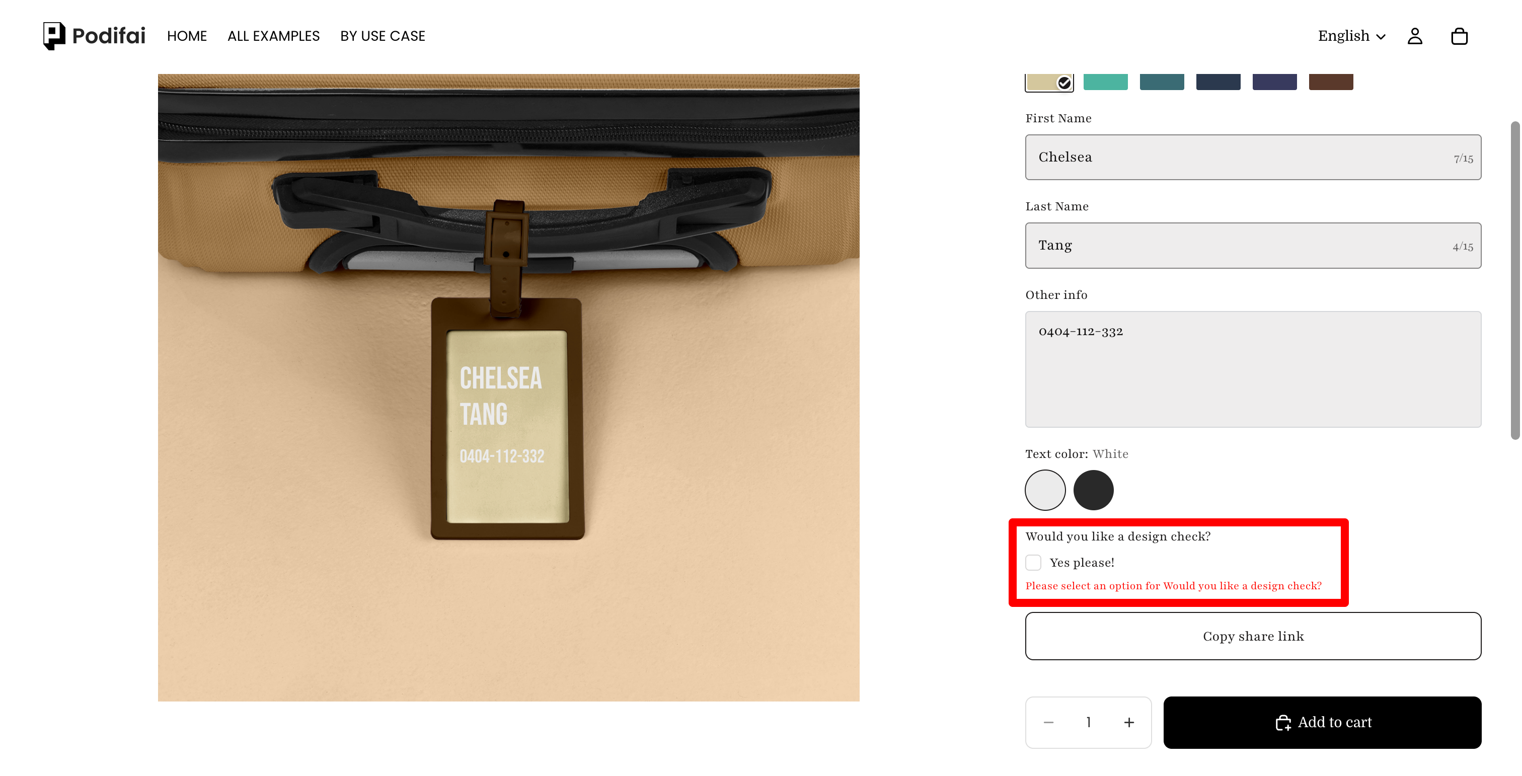
For example, use “I have checked my spelling” as the checkbox text. Customers must actively check the box before adding the product to the cart.
Check the Shopper Flow
If the customer clicks Add to cart without checking the required box, a warning appears and submission is blocked. After checking the box, they can add the product if all other required fields are valid.
Offer Optional Extras
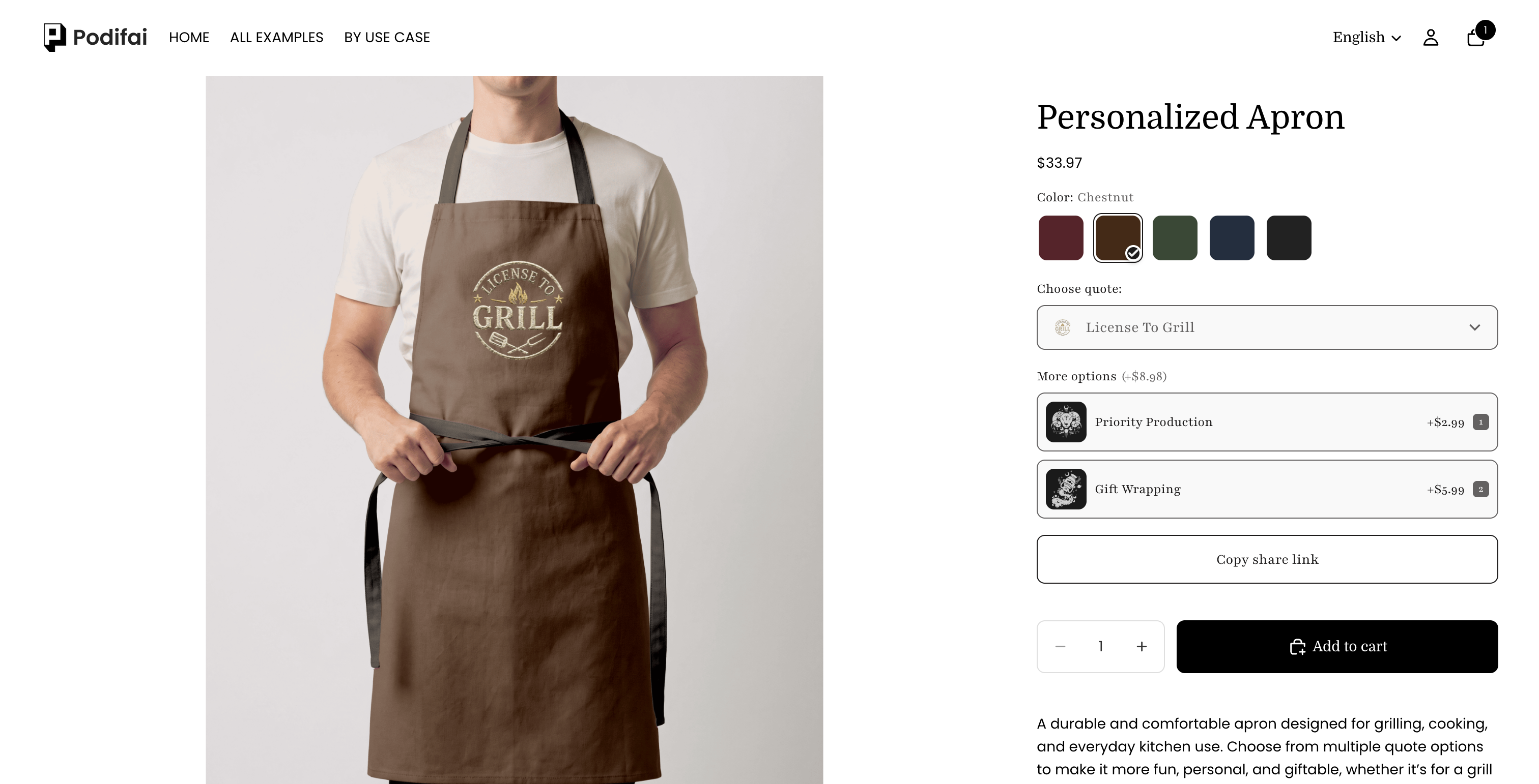
- Add values such as Priority Production and Gift Wrapping.
- For optional extras, turn off Required field and leave Default option empty.
- Turn on Allow multiple option values so customers can choose more than one extra.
- Set Min selections and Max selections. Use a minimum of 0 if customers can skip all extras.
- Open each value and configure its Price adjustment.
FAQ
Which option types support Group options?
Only Image Swatch and Checkbox. Enable Group options under Field > Option values to create up to 10 groups per field, with an optional All tab and a search bar that searches labels across all groups.
Is Checkbox available in Podifai?
Yes. Drag Checkbox from the editor's Option Type panel into the option form, then configure its values in Checkbox Properties > Field.
Does a Checkbox group always allow multiple selections?
No. Configure Allow multiple option values when shoppers should choose several values. Use Required field and Default option to set the group's required and initial selection behavior.
Can shoppers choose multiple units of a Checkbox value?
Yes. Enable Allow quantity per option and configure the available per-option and total quantity limits. This controls units inside one customized product; the product quantity selector controls whole products.